
A lot of people would love to know how the electoral map would change if the parliament was expanded.
We’ve already been able to get some idea of what might happen by looking back at the historical experience from the 1948-49 and 1983-84 expansions. But the political system has changed since 1984, as has the map.
So I wanted to try drawing my own map, attempting as best as I can to draw sensible boundaries that fit within population constraints, and then examine what those maps would mean.
I decided to draw a map for a House of 200 seats, which would be achieved by expanding the Senate to 16 senators per state.
I drew the map using two different tools. The Australian Redistribution Tool by JWood (a commenter on this blog), which was inspired by another tool by commenter Angas, is a very easy tool to use, particularly for small jurisdictions. For some of the biggest jurisdictions, I instead chose to use QGIS, with the Statto Redistricter plugin.
Unfortunately I don’t have projection data for most jurisdictions, so I used JWood’s estimates based on the number of votes cast at each SA1 at the 2025 election. I applied the stricter 3.5% allowance. These aren’t exactly the same as the actual numbers that would be used if a parliamentary expansion were to take place in 2026, but it gives us some sense. I also realise that I ended up using the current population numbers, not the projections, for South Australia, as I was used to using those numbers for other states. The whole thing is a thought exercise, but I have applied strict numerical limits regardless.
A lot of caveats are needed. For a start, my map is one of an infinite range of possible maps. I have tried to draw compact and logical maps, but there may be places where others with better local knowledge could draw them better. Where I have created new electorates, I have usually named them after local geography, to understand their location more easily. In a few cases I have resurrected abolished seat names like North Sydney, Higgins and Gwydir. In reality it would be a significant task to identify at least 50 honoured Australians to have new electorates named after them.
The new boundaries are based on combining SA1s, but in some cases a boundary would not follow the SA1 border. To take an example, the national parks to the south of the urbanised Blue Mountains is part of one huge SA1s. So on my map, the southern border of Macquarie runs just to the south of the urbanised part of the Mountains, when in reality it would follow the LGA border.
I should also note that I have not made any changes to Tasmania. We know Tasmania is undergoing a substantial redistribution, but it has nothing to do with the expansion of Parliament.
If the Senate was expanded to 16 senators per state, that would produce the following numbers per state:
- NSW – 62 (+16)
- VIC – 51 (+13)
- QLD – 40 (+10)
- WA – 22 (+6)
- SA – 14 (+4)
- TAS – 5 (-)
- ACT – 4 (+1)
- NT – 2 (-)
The ACT barely qualifies for a fourth seat if the parliament is expanded to this size. The Northern Territory’s two electorates, which are currently some of the smallest seats, would be closer to the average, while Tasmania’s over-representation would be reduced.
This map can be toggled to see the differences between the old and new boundaries.
This next map shows the location of newly created electorates. Understandably, they are spread all over the country.
Each state gained roughly one new seat for every three existing seats. While a lot of these seats are in the big cities, there are plenty of new rural seats too. The largest rural seats have tended to get smaller, but some of them are still quite large.
You can also toggle that map to see which seats are marginal (under 6%) on the actual 2025 map, and on my alternative map. Most of the marginal seats are in similar areas but there is some variation.
So with all these caveats in mind, this is my estimate of how the 200 seats would have split based on my boundaries (using 2025 votes).
The Labor government would hold 120 seats, which is 60% of all seats. That is the equivalent of 90 seats in the current House, so they gain slightly less than their proportionate share.
The Coalition increases from 43 to 62, with the Liberal Party benefiting slightly more than the Nationals.
The Greens and Katter’s Australian Party each gain a second seat, and four extra independents are elected.
Overall the ALP increases their numbers by 27.7%, the Coalition by 44.2%, and the crossbench by 38.5%. It may be that the dominant party just doesn’t end up being quite so over-represented in a larger chamber, but I can’t say that with certainty.
This next chart is a replica of one that I made for the 1948 and 1983 redistributions. It compares the shape of the two-party-preferred vote – as the Coalition 2PP increases, what proportion of the House’s seats would be held by the Coalition on a 2PP basis?
The two lines look very similar, although some of Labor’s safest seats are slightly less safe.
Since the 1980s, politics has moved away from the two-party contest. So this next chart also attempts to map out the distribution of two-candidate-preferred margins.
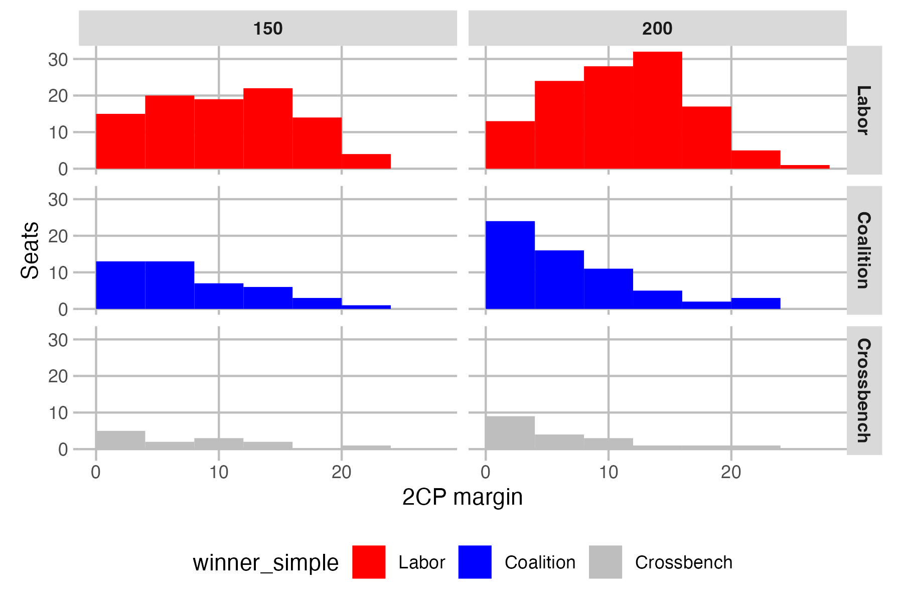
The Coalition accumulates rather a lot of marginal seats, while Labor’s gains are further up the pendulum. Crossbench gains are also in the most marginal seats. This may also explain why Labor’s gains are less than for the other groups.
With the creation of 50 new seats, there is a long list of seats that go to a particular party, and some existing seats flip from one party to another.
- Labor picks up Belconnen, Bankstown, Blacktown, Epping, Glenfield, Illawarra, Lake Macquarie, Pendle Hill, South Sydney, Terrigal, Brisbane East, Deception Bay, Ipswich, McDowall, Yeerongpilly, Mitcham, Prospect, Tea Tree Gully, Belgrave, Caulfield, Dandenong, Fawkner, Frankston, Nillumbik, South Barwon, Sunbury, Wyndham, Cockburn, Kalamunda, Kwinana, Stirling and Wanneroo
- The Liberal Party picks up Camden, Hawkesbury, Gawler, Cardinia, Higgins, Murrindindi and South-West
- The Nationals pick up Coffs Harbour, Goulburn, Great Lakes, Gwydir and Loddon
- The LNP picks up Buderim, Burnett, Lockyer and Southport
- Independents pick up North Sydney
- Katter’s Australian Party pick up Mount Isa
Seven seats flip between parties:
- Independents pick up Bean and Fremantle from Labor, and Lyne from the Nationals (although the winner is the former Cowper candidate)
- The Greens pick up Wills from Labor
- The Coalition picks up Hughes, Forde and Bendigo from Labor
While some MPs may see their seat flip under their feet, there is usually another nearby seat for them to jump into. The Labor MPs for Wills, Hughes, Forde and Fremantle would have the option of moving to Fawkner, Glenfield, Brisbane East and Cockburn, and the Nationals MP for Lyne could move to Great Lakes. There would be no nearby Labor seat near Bendigo, and it’s unlikely the Labor member for Bean would jump to the new seat of Belconnen. But overall, MPs would have a lot more options, with many having a choice of moving to a new seat.
To give some examples:
- The seat of Banks becomes substantially safer, but the local MP could also jump to the much safer seat of Bankstown, which takes in a big part of Banks.
- The Labor MPs for Menzies, Deakin and Aston would have the option of moving to Nillumbik or Belgrave.
- The Liberal member for La Trobe could switch to the slightly safer seat of Cardinia.
- The Labor member for Sturt could switch to Tea Tree Gully.
- The Labor member for Moore could switch to Stirling or Wanneroo.
Finally, you can see the partisan distributions on this next map, and you can toggle between the 150-seat and 200-seat map.
The parliamentary expansion doesn’t radically reshape the map. The Liberal Party’s problems in urban Australia don’t go away. They do pick up the seats of Higgins and Hughes, and a new seat in each of the Gold Coast and Sunshine Coast, but mostly Labor and crossbench domination of the big cities remains.
Once again I should emphasise that all of this is hypothetical – the precise population numbers won’t be what I have used, and the mapmakers will likely make many different decisions. But I think this exercise gives a sense of what may happen if parliament was expanded.

Ben, out of curiosity what was the 3CP you calculated for the new Macnamara?
I assume Labor’s wouldn’t have changed much but the gap between LIB & GRN would have significantly closed.
ALP 37.1%
LIB 33.2%
GRN 29.6%
So that’s an improvement for the Greens, weakening for the Libs, steady for Labor.
Thanks! The gap didn’t close as much as I would have expected with Caulfield gone and Prahran added, but I suppose also having Elwood removed would have toned down the difference.
Also the difficulty of factoring in the postal vote for that seat – in that the LIB strength & GRN weakness in it (as well as probably the % of votes that are postal to begin with) is probably heavily concentrated to the area being removed – means that gap may be even a little closer than that but obviously not enough to still close that 3.6% gap.
Is it possible that Goldstein will actually be Teal on these boundaries. The Libs did very well on Postal votes in Goldstein this often overrepresents the Jewish community as they dont vote on Sabbath. With Caulfield South removed i am wondering if the Liberal vote was over estimated in the proposed Goldstein by factoring in postal votes
That’s basically the point I was getting at with Macnamara too.
The difference between LIB & GRN in postal vs ordinary would likely be much larger in Caulfield than in the rest of Macnamara (ie. Jewish voters by post, non-Jewish ordinary), and similarly the Caulfield area would by far have the biggest postal vote din the seat too.
So the difference between LIB & GRN in the postal vote is probably considerably smaller in the areas remaining in Macnamara than those being removed. And if a more uniform approach was taken which is usually the case (because 95% of seats this isn’t such an issue) then it probably overstates the LIB vote and understates the GRN vote a bit.
It’d still be an ALP v LIB contest in Macnamara (whereas Goldstein is so close that factor could flip it to IND), but the gap between LIB & GRN might be closer to about 1-2%.
Yeah we’ve had issues before with odd margin calculations in Macnamara. I still think it’s a good methodology but it’s not perfect, and the postal votes in particular (absent and pre-poll too) are making it less accurate.
At one point I did develop a new model where I skewed the special votes to match the election day skew, applied it to Macnamara, and it didn’t change much. So since it was more complex, I dropped it.
@Ben Raue all good, thanks for the update.
Sorry for all the questions but is it possible to download these maps so we can make our own scenarios with them?
Yeah the way I have done it when trying to figure out notional redistribution margins has been to apply the skew, but that still only addresses part of the issue so it makes it a little more accurate but still not entirely.
That method at least applies a level of geographic difference, in that if for example Caulfield is +10 for LIB compared to the seat overall in ordinary votes, then that 10 point difference also applies to postal votes for Caulfield areas being moved.
But what it still doesn’t address is two other factors:
– Whether the overall postal vote % is higher between different areas (this would especially be relevant for Caulfield due to Sabbath);
– Whether the variance between parties even within that specific geographic area is even higher for postal votes than it is for ordinary votes (probably also relevant to Caulfield)
But I don’t think any data points actually exist to be able to incorporate those factors into a calculation so it’s actually impossible. For that reason in seats like Macnamara, I don’t think there’s a particularly better way to calculate it, but I mentally just assume it’s the LIB calculation is overestimated and GRN underestimated by about ~2%.
“– Whether the overall postal vote % is higher between different areas (this would especially be relevant for Caulfield due to Sabbath);” this would actually be covered, because I allocate postal votes to areas precisely in proportion to how many voters from that area voted.
@NP, sure, I can do that.
It’s a 4MB file, and that’s after I applied a bunch of shrinking to reduce the file size. Which is why sometimes the borders don’t quite fit perfectly. Turns out merging SA1s across the whole of Australia generates a pretty big file.
https://drive.google.com/file/d/1Q65Jo_yoRbAA3TL3ywFE2NGQY_2alQMM/view?usp=sharing
I think you’d find that the new Bradfield would be a three way context Labor – IND – Liberal as well. The new North Sydney that Ben has drawn should be also – but it will depend on how much of her existing vote Zali Steggall can transfer to a new IND and stop it going to a Labor candidate, where near 80% of it end up on preferences.
I’m presuming Stegall would contest the seat containing Manly
High Street, not sure if Kylea Tink would be interested in contesting the reincarnated North Sydney seat (or whatever new name it may have). She would potentially lead any 3CP count if she were to run, given her profile but the Liberals could have a chance of winning if they pick a high profile, moderate candidate (someone such as former Premier Gladys Berejiklian, ex Willoughby Mayor Gail Giles-Gidney or former MP Trent Zimmerman).
Oh yeah good point about the % of postal votes.
(Enrolled Voters * Turnout %) – Ordinary votes at relevant polling places = Non-Ordinary votes would capture that.
So it’s really only the one factor that wouldn’t be captured.
Ben, what’s your electorate size in NSW? Richmond seems to be a very large electorate population ise.
The numbers are based on JWood’s enrolment estimates, and they seem to add up to the actual votes cast in 2025, not the total enrolment. JWood’s numbers are about 5.2 million in NSW, compared to 5.2 million voters and 5.7 million eligible elctors in 2025.
So my Richmond seems to have about 85,000 2025 voters, whereas the actual 2025 Richmond had about 113.5k voters.
@Yoh An it also depends on how big of a campaign Labor decides to run in North Sydney. They may try their luck with any of Berowra, Camden, Epping, Hawkesbury, Hughes, or Page in NSW. The huge swing in Bennelong this year coincided with Kylea Tink’s absence, and much of her vote flocked straight to Jerome Laxale.
I agree the Liberals could win with a high profile, moderate candidate, especially given such a seat would be an open seat, but if an Independent wins it, good luck getting it back.
yeah my back of the envelope calculations suggest a 2025 population of around 160,000 based upon projections
CJ, Jerome Laxale’s local popularity in the Ryde area being a former councillor and Mayor certainly helped overcome the disadvantage and win against Scott Yung (who may have been seen as an outsider). He could switch over to the new seat of Epping (which covers Eastwood, the part he represented as councillor for Ryde West Ward) and let a new candidate run for Bennelong (like fellow Ryde Councillor Penny Pedersen, who represents the Gladesville based East Ward).
For Page – current Lismore State MP Janelle Saffin is a strong contender for Labor, but she may not want to return to Federal Parliament given her age and could retire at the next 2027 NSW election. Likewise, Sally Quinnell who holds the state seat of Camden may be a good candidate to run for the federal seat but as a first term MP, Labor would prefer her to defend the state seat instead.
Hi Ben. Great work. Out of curiosity what was the 3CP you calculated for the new Ryan? Is Labor close to making 2CP and winning the seat? I would also like to know the 3CP for Yeerongpilly, Richmond, Cunningham, Macnamara and Perth as the Greens can be competitive for making 2CP in these seats.
Ryan I had to estimate a 3CP because it took in a small bit of Blair which was ALP-LNP-ON.
Perth also took in a bit of Curtin but I didn’t need to calculate a 3CP there because it was definitely classic. For these numbers I’ve just ignored that tiny bit of Curtin.
Electorate ALP LNP GRN
Cunningham 46.13 29.33 24.54
Macnamara 37.12 33.23 29.65
Perth 43.55 30.17 26.28
Richmond 33.35 35.27 31.38
Ryan 29.25 40.31 30.43
Yeerongpilly 40.33 32.61 27.06
Thanks Ben. So your new boundaries make it slighly more difficult for the ALP to win Ryan by widening the 3CP gap between ALP and GRN while also making it easier for the Greens to win Richmond by closing the 3CP gap between ALP and GRN. All other seats listed should be safely held by Labor.
I am curious what the estimated primaries for Hasluck would be? on these maps
Looking at Metro Sydney, I can’t see any other seats within striking distance for teals or the Greens. Only the proposed North Sydney is for a teal. The Labor results in Sydney, Grayndler and Kingsford-Smith were so strong in 2025 that the proposed seats are far from winnable for the Greens. Also, the electorally Greenest parts of Sydney – Inner West and Sydney LGAs, are split up.
@Nimalan, Trent,
I believe that Ben’s proposed Caulfield (stretching from Elwood to Hughesdale) and Higgins can become three-way contests considering teal candidates may enter. Both proposed seats contain parts of a current teal seat and an ex-teal seat. However, history shows that teals don’t do that well in marginal ALP vs LIB seats. A big reason is that both major parties funnel resources and can out-campaign the teal candidates. Teals normally do better in safe Liberal or safe Labor seats.
What might an expanded parliament map look like?
https://www.tallyroom.com.au/63684
According to Ben’s map, the new seats created consist of 32 notional ALP seats, 16 notional Coalition seats and 2 notional crossbench seats. More than 60% of the new seats created are notional ALP seats, however this is roughly the same percentage as the percentage of seats currently held by the ALP. If the 2025 federal election were held on such boundaries, Labor would win 26 more seats, the Coalition would win 19 more seats and the crossbench 5 more seats. Although Labor would pick up more seats than any other party, the share of seats held by Labor and the Coalition would remain largely the same. Labor would have held 60% of seats in the new Parliament while it is currently holding 62.7% of seats. The Coalition would have held 31% of seats in the new Parliament while it is currently holding 28.7% of seats.
Overall, an expansion of Parliament would have benefitted both major parties proportionally. Therefore claims that an expansion of Parliament would cripple the Coalition or entrench Labor in power are ridiculous.
Among the 19 extra seats the Coalition would have won, only 4 will be located entirely within a capital city. The remaining 15 will be located in the Gold Coast, Sunshine Coast, rural areas, or a mix of urban fringe and surrounding rural areas. It does nothing to address the Liberal Party’s problems in capital cities.
Correction:
According to Ben’s map, the new seats created consist of 32 notional ALP seats, 16 notional Coalition seats and 2 notional crossbench seats. More than 60% of the new seats created are notional ALP seats, however this is roughly the same percentage as the percentage of seats currently held by the ALP. If the 2025 federal election were held on such boundaries, Labor would win 26 more seats, the Coalition would win 19 more seats and the crossbench 5 more seats. Although Labor would pick up more seats than any other party, the share of seats held by Labor and the Coalition in the House of Representatives would remain largely the same. Labor would have held 60% of seats in the new House while it is currently holding 62.7% of seats. The Coalition would have held 31% of seats in the new House while it is currently holding 28.7% of seats.
Overall, an expansion of Parliament would have benefitted both major parties proportionally. Therefore claims that an expansion of Parliament would cripple the Coalition or entrench Labor in power are ridiculous. If anything, an expansion could slightly increase the Coalition’s share of seats in the House of Representatives while slightly reducing Labor’s, as it is the case for Ben’s proposed expansion.
Among the 19 extra seats the Coalition would have won, only 4 will be located entirely within a capital city. The remaining 15 will be located in the Gold Coast, Sunshine Coast, rural areas, or a mix of urban fringe and surrounding rural areas. It does nothing to address the Liberal Party’s problems in capital cities.
@Votante I looked at a scenario that would divide the current Division of Sydney in half, and recreate the federation divisions of East and West Sydney. East Sydney would be a safe enough Labor seat (regardless of the 2CP opponent), but West Sydney is likely to be a more marginal seat against the Greens, like the current Cooper.
Also, think it would be worth naming that Caulfield division as Balaclava; there’s already a state seat of Caulfield, Balaclava is in the seat, and Balaclava was a federation seat.
@ Votante Re Proposed Higgins/Caulfield
I agree when a Teal contest in a marginal Labor/LIB seat then there is less tactical voting. However, we do have an issue that some current Labor/LIB voters may have a geninue preference for Teals being a centrist option. In the 2022 version of Higgins there was no Teal option and while i dont think a Teal would have made the 2CP i think many centrist voters would have preferred to vote for a Teal.
We saw in Hawthorn at the state eleciton in 2022 despite a sitting Labor Member the Teals nearly outpolled Labor on primaries.
For Higgins i think, Labor will be less interested on these boundaries as it much stronger than the 2022 version. So maybe willing to run dead to allow a Teal to hold the seat long term it also frees resources to when the proposed La Trobe which is now more urban.
For Caulfield,
East of Booran Road (Glen Huntly, Ormond, Carnegie, Murrumbeena and Hughesdale) are middle class areas where i dont think Teal will do as well when Labor is actually running a strong campaign
Caulfield proper and Elstenwick wealthy areas where there is a genuine preference for a Teal over 3 other parties
@ Ben Raue
Can you do a 4CP Breakdown (incl Teal) for Higgins and proposed Caulfield. i note there parts of both seats that overlap with areas a Teal did not contest.
West of Hotham Road-left leaning areas like Elsternwick more Green than teal a lot of renters
I won’t try and calculate a 4CP but here are the primaries for the requested seats.
Seat ALP LIB GRN
Caulfield 33.25 34.87 18.33
Higgins 24.63 42.64 11.10
Hasluck 48.40 22.12 14.72
Thanks Ben
@ Votante made a typo when looking at Cauflield
West of Hotham Road state Route 25 (Port Philip LGA)-left leaning areas like Elwood more Green than teal a lot of renters
I’m assuming the really low Greens vote in Higgins is due to the Teal vote through there?
Kind of wondering out of interest what would be the number of seats needed for Tasmania to finally break through its minimum number of 5 that it’s had since basically federation, assuming current population trends? Not that I expect an expansion to reach said number.
In that new/proposed Higgins, most of the affluent Stonnington areas (Toorak, Armadale, Malvern) and even the more Greens-friendly area of Prahran East were all in Kooyong in the 2025 so the Greens vote there would definitely have been supressed by the Monique Ryan vote, while all the strongest Greens areas from the old Higgins (Prahran, South Yarra & Windsor) are removed from that 200-seat version of Higgins.
I think that proposed Higgins, with middle class areas like Murrumbeena & Carnegie as well as the left/Green areas around Chapel St all removed in comparison to the previous Higgins, it would absolutely be a prime “teal” seat where Labor realistically wouldn’t be particularly competitive and would run dead, as Nimalan suggests. It’s probably as teal-friendly, if not moreso, than the current Kooyong & Goldstein.
Caulfield on the other hand I also agree with Nimalan than only the central Caulfield & Elsternwick area would be teal-friendly, but even they would be less-so than most of Kooyong, Goldstein or the proposed Higgins. The rest of Caulfield though is either traditional ALP/LIB territory (Glen Huntly, Carnegie, Hughesdale etc) or Green/Left territory (Elwood and its share of Balaclava & St Kilda East).
Has anyone considered having less politicians. We would certainly save a lot on travel expenses.
doubtful your then increasing electorate size and the numbers of constituents. you then probably will have to increase staff numbers to compensate. greater transparency is needed. i hope they ride Anika Wells hard all the way to the next election.
you would probably see an increase in travel expenses.
I can’t see what Wells has done wrong. Sure, she’s incompetent, but if that were illegal, half to three quarters of them would be in jail.
taxpayers funding family holidays is a rort. it should be for official business. their should be an external audit of entitlements. kind of like when employees have to justify expenses on the company credit card. if you want to take your family on a holiday do it on your own money and time.
also $100,000 for flights to spuik the under 16 soical media ban in the US? Rort. MPS can fly business class but staff can fly economy with extra leg room.
@WL_ Tasmania always punched above it’s weight in terms of Primary production, it had 5 of the original 75 Members, so why not 10 of the 150 now?
@ wl probably about 250 at least.
i reckon scrap business class for domestic flights and make it so they can purchase 2-3 economy seats instead so at least they have exrtra room and arent packed in like sheep
@ John
This is not right thread. The topic is nothing to do with Anika Wells no please delete commnts that are not relevant.
@ Trent/Votante
I agree i think the Caulfield/Elstenwick portion of Glen Eira is the wealthiest and has a lot of Private Schools etc but it still not as rich as the suburbs found in Borrondoora, Stonnington and Bayside councils maybe a bit less Tealish than Armadale, Beaumaris, Balwyn etc.
I used the Hotham Road/Port Philip to describe the Green/Left areas the reason is that the Glen Eira portion of St Kilda East is more suburban like Caulfield than Green/Left renter areas. Hotham Road which also an LGA boundaries IMHO is the divide between Inner City and Inner Suburban areas just like Warrigal Road divides the Inner Suburban areas from Middle Suburban areas.
@Nimalan, Trent
If there’s an expanded parliament, I think the Liberals would love to see:
– Macnamara with just Port Phillip LGA and South Yarra. This would probably ensure a Labor vs Greens contest.
– A new seat with the eastern parts of Stonnington and Glen Eira LGA, so that Toorak, Malven and Caulfield are in one seat. However, this may create a three-way contest (Liberal, Labor and teal).
@Joseph
Let’s say there’s a 200-seat parliament and everyone voted every polling booth’s result was exactly the same as in 2025. Based on Ben’s proposals, Labor would grow by 28% and the Coalition would grow by 44%. The Coalition’s number of seats would proportionally increase more. This is because in 2025, Labor almost won 9 out of the 10 seats in TAS, ACT, NT. In an expanded parliament, only ACT would get an extra seat. In Ben’s proposed ACT electorates, an independent would claim one.
An expanded race would make mainland state electorates smaller but also more competitive, regardless of boundaries.
@votante Jessica Price is probably gonna win Bean regardless. With the redistribution she may even be notionally in front. She’s already committed to run again in 2028 and with labor almost losing at a high watermark how can Labor possibly hold it?
On these numbers Pauline Hanson could retire from the Senate and run in Lockyer – surely One Nation’s most winnable seat in this map.
Doubtful I seriously doubt any expansion would be completed by 2028. Pauline is up for reelection in 2028. It will probably be her last bout as terms last 6 years.
She’s also 71, not sure why she’d continue.
Out of spite, probably. Hanson has never been one to go down quietly.
Comments are closed.