
A lot of people would love to know how the electoral map would change if the parliament was expanded.
We’ve already been able to get some idea of what might happen by looking back at the historical experience from the 1948-49 and 1983-84 expansions. But the political system has changed since 1984, as has the map.
So I wanted to try drawing my own map, attempting as best as I can to draw sensible boundaries that fit within population constraints, and then examine what those maps would mean.
I decided to draw a map for a House of 200 seats, which would be achieved by expanding the Senate to 16 senators per state.
I drew the map using two different tools. The Australian Redistribution Tool by JWood (a commenter on this blog), which was inspired by another tool by commenter Angas, is a very easy tool to use, particularly for small jurisdictions. For some of the biggest jurisdictions, I instead chose to use QGIS, with the Statto Redistricter plugin.
Unfortunately I don’t have projection data for most jurisdictions, so I used JWood’s estimates based on the number of votes cast at each SA1 at the 2025 election. I applied the stricter 3.5% allowance. These aren’t exactly the same as the actual numbers that would be used if a parliamentary expansion were to take place in 2026, but it gives us some sense. I also realise that I ended up using the current population numbers, not the projections, for South Australia, as I was used to using those numbers for other states. The whole thing is a thought exercise, but I have applied strict numerical limits regardless.
A lot of caveats are needed. For a start, my map is one of an infinite range of possible maps. I have tried to draw compact and logical maps, but there may be places where others with better local knowledge could draw them better. Where I have created new electorates, I have usually named them after local geography, to understand their location more easily. In a few cases I have resurrected abolished seat names like North Sydney, Higgins and Gwydir. In reality it would be a significant task to identify at least 50 honoured Australians to have new electorates named after them.
The new boundaries are based on combining SA1s, but in some cases a boundary would not follow the SA1 border. To take an example, the national parks to the south of the urbanised Blue Mountains is part of one huge SA1s. So on my map, the southern border of Macquarie runs just to the south of the urbanised part of the Mountains, when in reality it would follow the LGA border.
I should also note that I have not made any changes to Tasmania. We know Tasmania is undergoing a substantial redistribution, but it has nothing to do with the expansion of Parliament.
If the Senate was expanded to 16 senators per state, that would produce the following numbers per state:
- NSW – 62 (+16)
- VIC – 51 (+13)
- QLD – 40 (+10)
- WA – 22 (+6)
- SA – 14 (+4)
- TAS – 5 (-)
- ACT – 4 (+1)
- NT – 2 (-)
The ACT barely qualifies for a fourth seat if the parliament is expanded to this size. The Northern Territory’s two electorates, which are currently some of the smallest seats, would be closer to the average, while Tasmania’s over-representation would be reduced.
This map can be toggled to see the differences between the old and new boundaries.
This next map shows the location of newly created electorates. Understandably, they are spread all over the country.
Each state gained roughly one new seat for every three existing seats. While a lot of these seats are in the big cities, there are plenty of new rural seats too. The largest rural seats have tended to get smaller, but some of them are still quite large.
You can also toggle that map to see which seats are marginal (under 6%) on the actual 2025 map, and on my alternative map. Most of the marginal seats are in similar areas but there is some variation.
So with all these caveats in mind, this is my estimate of how the 200 seats would have split based on my boundaries (using 2025 votes).
The Labor government would hold 120 seats, which is 60% of all seats. That is the equivalent of 90 seats in the current House, so they gain slightly less than their proportionate share.
The Coalition increases from 43 to 62, with the Liberal Party benefiting slightly more than the Nationals.
The Greens and Katter’s Australian Party each gain a second seat, and four extra independents are elected.
Overall the ALP increases their numbers by 27.7%, the Coalition by 44.2%, and the crossbench by 38.5%. It may be that the dominant party just doesn’t end up being quite so over-represented in a larger chamber, but I can’t say that with certainty.
This next chart is a replica of one that I made for the 1948 and 1983 redistributions. It compares the shape of the two-party-preferred vote – as the Coalition 2PP increases, what proportion of the House’s seats would be held by the Coalition on a 2PP basis?
The two lines look very similar, although some of Labor’s safest seats are slightly less safe.
Since the 1980s, politics has moved away from the two-party contest. So this next chart also attempts to map out the distribution of two-candidate-preferred margins.
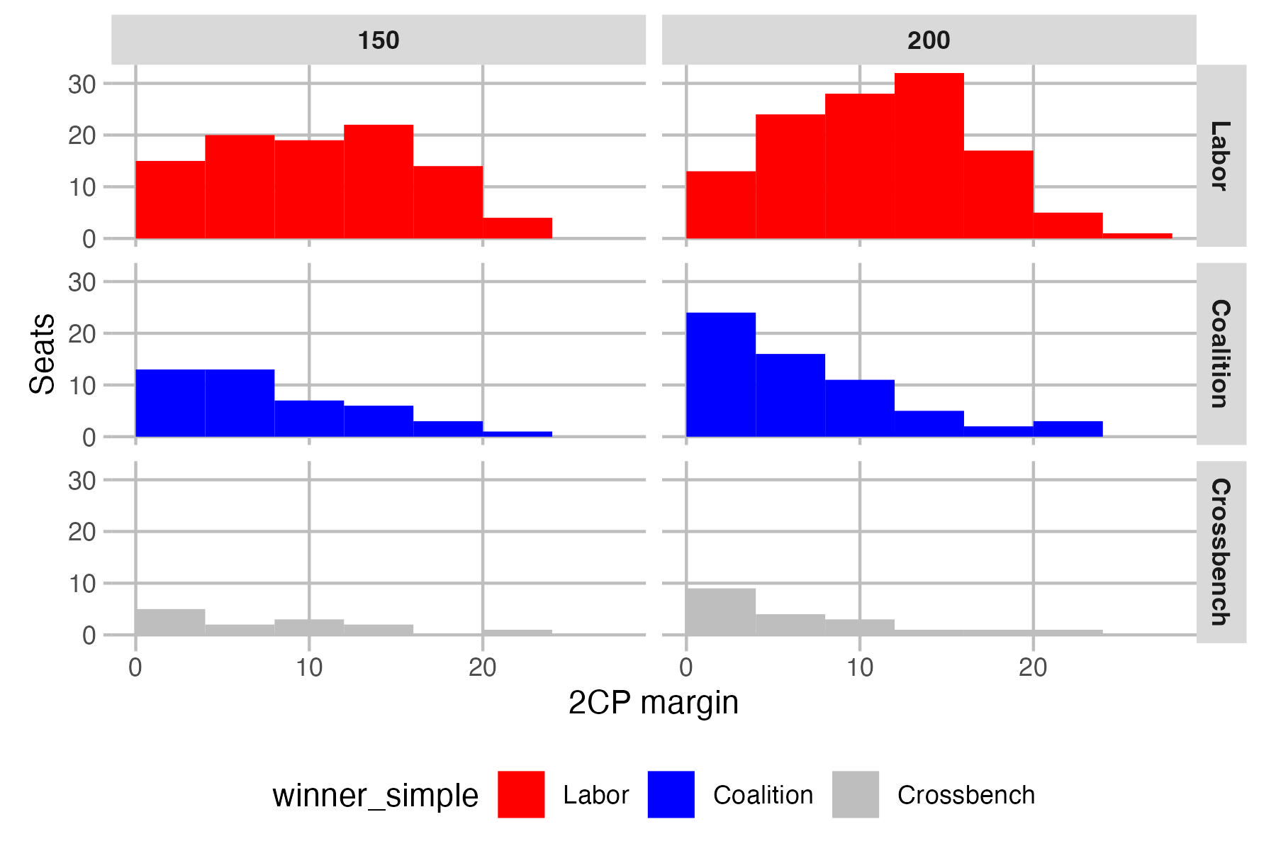
The Coalition accumulates rather a lot of marginal seats, while Labor’s gains are further up the pendulum. Crossbench gains are also in the most marginal seats. This may also explain why Labor’s gains are less than for the other groups.
With the creation of 50 new seats, there is a long list of seats that go to a particular party, and some existing seats flip from one party to another.
- Labor picks up Belconnen, Bankstown, Blacktown, Epping, Glenfield, Illawarra, Lake Macquarie, Pendle Hill, South Sydney, Terrigal, Brisbane East, Deception Bay, Ipswich, McDowall, Yeerongpilly, Mitcham, Prospect, Tea Tree Gully, Belgrave, Caulfield, Dandenong, Fawkner, Frankston, Nillumbik, South Barwon, Sunbury, Wyndham, Cockburn, Kalamunda, Kwinana, Stirling and Wanneroo
- The Liberal Party picks up Camden, Hawkesbury, Gawler, Cardinia, Higgins, Murrindindi and South-West
- The Nationals pick up Coffs Harbour, Goulburn, Great Lakes, Gwydir and Loddon
- The LNP picks up Buderim, Burnett, Lockyer and Southport
- Independents pick up North Sydney
- Katter’s Australian Party pick up Mount Isa
Seven seats flip between parties:
- Independents pick up Bean and Fremantle from Labor, and Lyne from the Nationals (although the winner is the former Cowper candidate)
- The Greens pick up Wills from Labor
- The Coalition picks up Hughes, Forde and Bendigo from Labor
While some MPs may see their seat flip under their feet, there is usually another nearby seat for them to jump into. The Labor MPs for Wills, Hughes, Forde and Fremantle would have the option of moving to Fawkner, Glenfield, Brisbane East and Cockburn, and the Nationals MP for Lyne could move to Great Lakes. There would be no nearby Labor seat near Bendigo, and it’s unlikely the Labor member for Bean would jump to the new seat of Belconnen. But overall, MPs would have a lot more options, with many having a choice of moving to a new seat.
To give some examples:
- The seat of Banks becomes substantially safer, but the local MP could also jump to the much safer seat of Bankstown, which takes in a big part of Banks.
- The Labor MPs for Menzies, Deakin and Aston would have the option of moving to Nillumbik or Belgrave.
- The Liberal member for La Trobe could switch to the slightly safer seat of Cardinia.
- The Labor member for Sturt could switch to Tea Tree Gully.
- The Labor member for Moore could switch to Stirling or Wanneroo.
Finally, you can see the partisan distributions on this next map, and you can toggle between the 150-seat and 200-seat map.
The parliamentary expansion doesn’t radically reshape the map. The Liberal Party’s problems in urban Australia don’t go away. They do pick up the seats of Higgins and Hughes, and a new seat in each of the Gold Coast and Sunshine Coast, but mostly Labor and crossbench domination of the big cities remains.
Once again I should emphasise that all of this is hypothetical – the precise population numbers won’t be what I have used, and the mapmakers will likely make many different decisions. But I think this exercise gives a sense of what may happen if parliament was expanded.

Fascinating work Ben. Two points:
1. The seat of Ipswich does not actually contain Ipswich – Springfield would be a more appropriate name.
2. Gwydir and Murrindindi would be the best examples of “bits and pieces” seats here (along with Lyons)
My issue with the map is the continued splitting of Queensland’s regional cities that fracture any community of interest. The only LGA that needs to be split due to population is Townsville.
For example, the seat of Dawson contains part of Mackay, most of Whitsunday, part of Burdekin and finishes in the Townsville suburbs. Instead it could contain all of Mackay and all of Whitsunday – including Collinsville which is currently in Capricornia.
It is a source of endless frustration that these issues are repeated each election while there are endless debates about individual streets in South-East Queensland.
The Victorian suggestions make a lot of sense, great work by Ben
There will always be a bits and pieces seat and Murrindindi would always be a prime candidate for such a seat as I believe McEwan has been one in the past
Great work Ben!
For the most part these boundaries make sense, there are some slight changes I would want to make around Deakin the end part looks really odd, Aston I would want the Creek as the boundary and I think having Lake Corangamite in Corangamite would be ideal as well.
Under this map, I can potentially see the Liberals being able to pick up the new seats of Deception Bay and Epping if they run suitable candidates. For Epping, Labor could hold it if Jerome Laxale moves to contest there instead of Bennelong.
This was a lot of fun to peruse! Great work, Ben. This makes a compelling case for an expansion of parliament. Flicking back to the 150-seat map from the 200-seat map… goodness… it really makes you realise just how monstrously oversized the current electorates are.
What an absolute waste of space. Firstly Australia is over represented in Federal parliament and having 16 state senators would result in a totally unworkable chamber. You have also not considered community of interest in your redistribution. Not following LGA boundaries is a prime example. This country needs more States and less representatives
Mark, I’d be interested in your thoughts in how you’d draw those north Queensland seats. I found both on the central and north coast of QLD and the north coast of NSW it is very hard to avoid splitting the big cities (Port and Coffs have the same problem).
@Ben Raue Challenge Accepted Ben! 🙂 The problems starts with Noosa (which is really a Sunshine Coast seat) and then creates dislocations all the way up the coast. Which is why Kennedy wanders around like a drunk uncle at a wedding…
Mark, you can use this site to draw your own map. It works for QLD. https://auredistribution.com/fed_qld_2026.html
Nino, there’s always going to be LGAs that need to be split but I’ve used a lot of LGA borders! If you have specific criticisms I’d be interested in them, like I said I’m sure a proper process could produce better maps.
I don’t see how a bigger Senate would be “unworkable”. It’s a bit strange to say we’re over-represented when our parliament is so much smaller than other similar countries.
I do have a few issues with some of the new Brisbane and would like to a see a 175 and a 162 seat proposal. But otherwise great work
Hi! I only had one question with this map, how did you manage to put the vote shares of the candidates on the map as AURedistributions currently does not have that feature, also, how did you merge the maps?
Any help would be greatly appreciated as I’ve tried doing something like this in the past but I wasn’t sure how, these may seem like slightly stupid questions so I’m sorry about that.
So I decided to go back to first principles and drew a fairly coherent Mackay-based Dawson. I figure if you could make that work with areas further north and west then you could make the other central Queensland seats work. It covers the Whitsunday LGA and the eastern half of Isaac LGA.
But the areas to the north and west – the parts previously in Dawson, plus Herbert, Kennedy, Leichhardt, and I even added in the western half of Isaac and added a bunch of south-western LGAs to Kennedy, have pretty much 4.5 quotas of population. And Kennedy can’t keep creeping deeper into Maranoa without being absolutely enormous.
So I think unifying the central Queensland cities would require some pretty crazy map-drawing further inland.
I don’t think a 162-seat map is possible?
Hi Owen, not stupid questions at all.
I use R, specifically the tidyverse. The part that merges the SA1s into a single polygon is this ugly bit of code in a for loop:
for (i in 1:nrow(newelectorates_list)) {
newelectorate_name = newelectorates_list$ProposedDivision[i]
temp_polygons = sa1_shapefiles_newelectorates %>%
filter(ProposedDivision == newelectorate_name) %>%
group_by(ProposedDivision) %>%
summarise() %>%
rename(Name = ProposedDivision) %>%
select(Name,geometry)
if(i == 1) {
new_house_polygons <- temp_polygons } else { new_house_polygons <- rbind(new_house_polygons,temp_polygons) } } As far as the vote estimates - I have calculated the number of votes per SA1 based on the number of votes cast at each SA1 from each polling place. I don't share this data but it is possible to calculate this.
@Ben Raue
Thank you so much! That is genuinely really helpful!
Also, just noticed this, RIP to me and all the lefties in Central Victoria
Owen, I was surprised to see the breakup of Bendigo into two makes it worse for Labor. But checking federal polling place results, it makes sense as the best areas for Labor were in the south, around Kyneton and Castlemaine which are combined with ultra safe National voting areas further west. Labor’s vote in Bendigo and surrounds was much lower.
@Yoh An, indeed, it did feel a bit like it split the COI of the leftwing vote in the Kyneton-Daylesford-Castlemaine area, not a gerrymander, because that implies it was on purpose but certainly a bit of a COI split. Particularly because that triangle is so politically different to the other areas in the new Loddon electorate (which I feel should be named Quick because John Quick was basically the only big whig federation person from regional Victoria and he was from the Bendigo area, but that’s just a nitpicky thing).
Agree Owen, this is one of the few places where the community of interest (COI) is split compared to the old map. At a state level, it is Bendigo itself which is split with one half combined with the Castlemaine area as Bendigo West, and the other half combined with Eaglehawk and adjacent smaller communities as Bendigo East.
I will need to study the maps when I can find a hole to climb into with plenty of kombucha and not come out for three days… All of this information, I feel like a mosquito that flew into a nudist camp, I don’t know where to begin…
That said, aside from the basic argument of size/population constraints, I think the most significant effect of this will be that it will almost certainly force the Liberals into a centrist position. A necessary one, I would say, but it would drive the far right bonkers.
I can’t wait until Mark Yore is bored again and blesses us with an extended take on where this is all going…
In general, I am starting to shift a bit away from treating geographical bits as hard borders for communities of interest and toward the commonality of living, driving, work, etc. These days, a bridge means nothing in an urban environment.
There is a bloke on YouTube who looked at an expanded parliament from the perspective of a uni student voting. He surmised that there are up to twenty seats where students would make up a significant share of the vote.
Love the maps Ben! Great work!
Great maps Ben!
I mostly looked around Melbourne as it’s what I’m most familiar with but really like the boundaries of a 200 seat map, I think they are far better than the current ones and actually address/improve a lot of issues.
The new seat running from Elwood/Elsternwick through to Murrumbeena/Hughesdale has a great community of interest and strong boundaries, currently I feel like Murrumbeena is out of place in Hotham and fits better with Caulfield.
The new Higgins boundaries are better better than the pre-abolished Higgins boundaries, and likewise the Macnamara boundaries are ideal, perfectly capturing a cohesive “inner-south” community of interest.
Fawkner also has excellent boundaries as a new seat in the north, taking a lot of very similar from Maribyrnong and Wills that fit well together.
@Craig it depends on the scale of the bridge, and how significant it is. For example, a bridge over a narrow creek can be ignored, but Sydney Harbour Bridge and Brisbane’s Captain Cook and Story Bridges should be considered.
In terms of the University population point, I’m guessing – from looking at Ben’s map – that the significant University seats are:
– Bennelong, NSW (Macquarie University)
– Canberra, ACT (ANU)
– Cockburn, WA (Murdoch)
– Cunningham, NSW (UOW)
– Hotham, VIC (Monash)
– Kingsford Smith, NSW (UNSW)
– Melbourne, VIC (University of Melbourne, RMIT, Monash)
– Newcastle, NSW (UON)
– Parramatta, NSW (WSU)
– Perth, WA (Edith Cowan)
– Ryan, QLD (UQ)
– Swan, WA (Curtin)
– South Sydney, NSW (USYD)
– Sydney, NSW (UTS)
There’d be still a whole heap of others which I haven’t really looked at, but those are the most notable I could find.
Very interesting read.
An expanded parliament would make metro Sydney’s electoral maps better looking and unite communities of interest and minimise isolated parts or parts crossing major geographical barriers. Metro Sydney loses seats as the population share of the country’s is declining whilst parliament size has been stuck at 150 or 151 HoR seats for decades now.
A major problem at present when drawing electoral boundaries in Metro Sydney is that there are a lot of geographical barriers both within and at the boundaries. There is Sydney Airport which isn’t even on the edge of the metro area or by the sea like most other major airports are. It too acts like a geographical barrier. These barriers make seats like Hughes, Cook and Kingsford-Smith look disjointed.
I Don’t see the electoral boundaries of Griffith crossing over the Brisbane River as it serves as a natural boundary
Great Work Ben
It feels that many of the recently abolished seats have been resurrected
1. Higgins
2. North Sydney
3. Stirling
4. Charlton (Lake Macquarie)
5. Old Reid (labelled McMahon)
6. New Reid (Lowe)
7. Gwydir abolished in 2007
8.Old Wakefield (Gawler) Abolished in 2004
9 Corinella (Cardinia) Abolished in 1996
10. Hawker (Mitcham) Abolished 1993
11. Streeton (Nilumbik) Abolished 1990-not quite the same but that name can be given to the seat.
@Caleb me neither but that’s probably my only gripe with the map. Brisbane not being in Brisbane seems like a cardinal sin!
After pushing the numbers it’s also possible to recreate two more old seats; East Sydney and West Sydney. That’s done by effectively splitting the current Sydney in half, forgoing a South Sydney division, and cutting Sydney City down the middle. It can pass the Federation Name rule but I’m not certain it would pass a COI pub test.
A new West Sydney would likely be a competitive seat for the Greens to win, as well.
Fantastic work Ben! Lots of new boundaries pore over!
It’s interesting how the new map feels completely foreign to me but more or less preserve the electoral landscape as it currently is. While some may try to argue otherwise, our redistribution system directly aims to uphold the “one vote-one value” principle and thus the ratios between parties, subregions and states, outside any changes in relative populations.
Overall there’s a massive strong improvement to “community of interest” by the simple fact of more condensed divisions and fewer arbitrary river crossings, although the nature of the game means that to fix some areas others will have to be cut up.
Thanks for the shout-out regarding the redistribution tool. I’ve certrainly slacked off on development now that JWood has taken on the reins, but I’m keen to help add some features over the summer break and see if it can be made a bit easier to work on these larger scale redistributions.
Great maps and analysis Ben!
Some of the results of the new boundaries are very interesting. In my seat of Cooper I’d have thought that taking most of Reservoir out would make it much more competitive for the Greens, and that taking the northern part of Wills would push the margin for the Greens out to 4 or 5%. Also would’ve thought taking the southern tail of Melbourne out would flip it back to being a Greens seat. Also thought putting Labor’s strongest areas in Aston into Belgrave would potentially make Aston Liberal. Not disputing any of these figures by any means, I just find the results really interesting.
It also shows how it was the progressive heartlands around Castlemaine and Kyneton that saved Bendigo for Labor, and that a seat purely based on Bendigo itself would’ve flipped.
Ben, could we please see the notional TPP as well?
Also wouldn’t it be better to name Coffs to Page given Sir Earle Page was from Grafton?
But other than that thanks so much, great work!
NP, it’d be a bit of a pain to modify the map and re-upload a new version, so I’ve just uploaded the spreadsheet which compares the old and new margins: http://www.tallyroom.com.au/wp-content/uploads/2025/12/200-seat-house-margins-BR-scenario.xlsx
I’m sure there would be a lot of sensible name changes, that wasn’t something I was trying to do. I kept the old name with the largest part of the old seat (possibly with the exception of Corangamite). None of my names should be taken as suggestions for how these seats should be named.
@Adam, yeah I was surprised by the minimalism of those changes. The Melbourne margin is cut. Perhaps it reflects that the difference between the north and south of Wills and Cooper shrunk in 2025.
[DISCLAIMER: No hate or offence intended towards Ben for his work – I actually really love this project undertaken and sincerely believe an amazing job has been done, just wanted to bring forward a point of discussion]
Am I the only one who dislikes the inelegant boundaries of Farrer/Riverina?
The orientation of Farrer especially as a long strip of electorate, and the misleading name of the Riverina electorate are things I have found really unideal – and having played around with the JWood redistribution tool myself (including on the post-expansion electorate quota numbers – I simply cannot find a combination that makes the borders clean.
In an ideal world I would like to see Farrer move east to become an urban-orientated electorate (Albury-Wagga corridor) with Riverina moving west/southwest to become solely a rural electorate (similar to the pre-2001 election situation), however population spread simply doesn’t allow this.
Yes, I understand why electorate names can’t always correspond with jurisdiction (population spread, etc), and yes I understand that the area sees population density concentrated in Albury/Wagga and sparse through to the NSW-SA border; BUT I would really like to see some sort of compromise situation.
Thoughts?
That’s a good point about Wills & Cooper. While more affluent inner-suburbs trended towards Labor, more working class suburbs in the north of the seats trended to the Greens which would have eroded that Bell St divide a bit.
I think there’s also a case where the geographical difference between postal votes is harder to capture in seats with either large geographic differences (probably more relevant to Macnamara) or where the Greens get a high vote, making the ordinary vs postal vote difference larger than usual.
Great work Ben, like the look of the seats in Victoria, this exercise shows why a larger parliament would better reflect local communities.
Other than those suggested (e.g. Lyne, Bean, Wills), will there be new seats that are within striking distance for minor parties and independents?
When seats are smaller, minor parties or independents don’t have to spread themselves as thinly as before and can channel resources to a much smaller geographical area. This means targeting less diversity in demographics. Which redrawn seats would compel them to plough resources?
Some of my guesses are:
Macnamara, Maribyrnong – Greens
Higgins – Independent, Greens (if not Labor)
Hunter, Capricornia – One Nation
In these cases, the new contests are marked as Labor vs Coalition.
Votante, Higgins looks more like a 3 corner contest between the Liberals, the Teals and Labor.
@ATGF, I actually agree with you. I had someone on Bluesky polite but disappointed that my Farrer made the electorate less urbanised with the removal of Griffith.
I found western NSW particularly awkward because the major cities aren’t big enough to have their own seat, but big enough that they severely limit your options.
That combined with the difficulty on the northern coasts of NSW and QLD to sensibly draw boundaries around major cities convinces me even more that single-member electorates are poor for local representation. Drawing a seat which cuts right through the middle of Port Macquarie is a real mess.
In the case of Albury and Wagga, it might be logical to have an Albury-Wagga seat, but it would leave the rural areas currently paired with those two towns in an absolutely enormous seat. It’s quite logical to give each of those cities a separate set of rural hinterland areas to avoid rural seats getting absolutely enormous.
@Pencil, you might be right. If it were 2019 or 2022 again then maybe the Greens would be competitive in Higgins.
I think the proposed Corangamite and Caulfield could be 3 way contests.
@Votante, the Caulfield seat would be fascinating, Elwood leaning Labor/Greens vs. Caulfield leaning Liberal.
@Ben all good, thanks.
However is Lyne supposed to be the other way around? I’m pretty sure that part of Lyne mostly voted Nats.
@Caleb @CJ As recently as 2001 Brisbane crossed over the river so there is precedent for those areas to be unified. And as a former resident of South Bank, I feel that there is more of a COI with the CBD then with the more eastern parts of the current Griffith
I know am getting ahead but a name for South Barwon would be Tucker as I know some people wanting to rename Corangamite. For Caulfield you could call it Child after Joan Child the first female speaker plus her seat of Henty was roughy based around that area.
@ Votante/Pencil
Yes Higgins and Caulfield will be interesting. As the Higgins not go South of Dandenong Road or West of Williams Road it maybe best for Labor/Greens to run dead and allow Teals to win it. The reason is that it is is notionally Lib even at the worst result post World war II and worst ever result in the state of Victoria. Labor maybe better of winning La Trobe on the new boundaries instead especially as population growth will make it more of a bellwether.
I think Caufield will be a ALP V LIB battleground apart from areas in Port Phillip Council the rest of the seat is Suburban where the Greens dont do well.
Interestingly a purely Shire based Hughes will be a Liberal seat even based on of the worst results for Libs.
@Votante, I don’t think that ‘Caulfield’ seat would be a three-way contest because I imagine the Greens vote would be considerably less than it is in the current Macnamara.
The current Macnamara includes St Kilda, Balaclava, Elwood, Southbank, Windsor & St Kilda which are all Greens strongholds (and that still wasn’t enough for 2025 to be a three-way contest), whereas that Caulfield seat only includes Elwood and small parts of Balaclava & St Kilda East while not adding any other strong Greens areas. It adds more traditional ALP v LIB areas like Carnegie, Murrumbeena & Hughesdale, which are mostly ALP leaning although Murrumbeena is a bit more ‘bellwether’.
I think that Caulfield seat would safely be a traditional ALP v LIB contest, clearly an ALP leaning one, but one that does still have a significant Greens vote contributing to Labor’s 2PP (probably around 20%).
On the other hand, with Caulfield removed the new Macnamara probably gets pretty close to being an ALP v GRN contest.
I am surprised that the new Corangamite, being almost identical to its pre 2016 configuration, is a marginal Labor seat. I guess it shows the demographic change of the Surf Coast area, and that it is hard for the Liberals to win it back.
@NP, the 3CP I got for Lyne was:
-Nat – 48.3%
-IND – 28.7%
-ALP – 23.1%
Most of Lyne comes from the old Lyne but it also adds a part of Port Macquarie from Cowper which was strong for the independent.
But thanks to your query I have just discovered I accidentally stuffed up the calculations for Mayo and Lyne. It significantly increases Sharkie’s margin in Mayo to 19.8%, and turns Lyne into a 5.1% NAT seat.
The new Corangamite may be a Labor seat, but when you consider the size of the Labor majority, it does lean more Coalition than the country. It’s a reflection of how much Labor won in 2025.
Comments are closed.