
We are still waiting for the final 2PP figures – they’ve finished in 149 seats and have even started the 2PP count in Bradfield now – but we now have basically all of the two-candidate-preferred figures in. We may not know the final Bradfield outcome, but for the purposes of today’s post it is close enough.
So for today’s post I wanted to look at the historical record for how a few key statistics are changing: what share of the primary vote is won by the winning candidate, the two-candidate-preferred margin, and the share of the vote cast for candidates who don’t make the two-candidate-preferred (which I will call “outside the top two” from here on in).
So, first of all, are races getting closer? It seemed in 2025 like there was more seats that were close. That was certainly the impression I had before crunching these numbers. But at least when looking at the 2CP margins, it’s not true.
The average and median 2CP margin is roughly in line with long term trends. There was an increase in marginality, but it happened back in the 1970s and 1980s, not recently. The picture is similar if you just look at all seat margins. The number of seats with a margin under 6% is at the lowest level since 2004 – 46 seats, compared to 61 in 2013 or 50 in 2022.
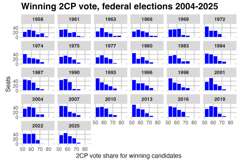
You can see that on this trend. There are slightly more seats in the 55-60% 2CP range this year, but fewer seats in the 50-55% range. Indeed there are more seats with margins over 65% or over 70%.
Now this doesn’t factor in the races where there was a close gap on the 3CP, and the candidate coming third may have been more competitive (or may have even been in a position to win). We don’t have the 3CP data yet, so I will revisit that topic then. Obviously seats like Brisbane, Fisher, Grey, Monash, Ryan and Forrest will be worth watching and may be more marginal if you consider both the 2CP and 3CP. But that is still a small list of seats.
So what about the primary vote for winners? Unsurprisingly, considering the plummeting support for the major parties and numerous seats where the top two was not clear, the share of the vote cast for winners has also collapsed.
The 1990 federal election was the first election in the modern era where less than half of voters cast a first preference vote for the winner in their seat. It happened again in 1998, and narrowly in 2001. But it has now happened at every election since 2001. The winning primary vote collapsed to just 42.3% in 2022, and is currently sitting on 41.2%. It will be 41.3% if Gisele Kapterian regains the lead in Bradfield and ultimately wins.
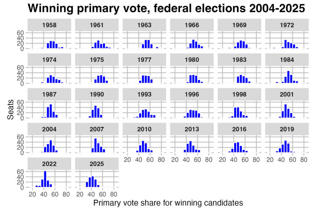
This decline is also obvious when you compare the distributions of winning primary votes since 1958. Only a handful of seats had a winner with a majority of the first preference vote, whereas as recently as 2007 there was 75 seats with a primary vote winner.
I should also briefly touch on the question of the lowest primary vote for a winner. At one point it looked like there could be a record low winning primary vote in Calwell, but Labor ended up winning fairly comfortably over Carly Moore. Over the last 67 years, this statistic has bounced around a bit but has been on a flat trajectory.
Uusally the lowest primary vote is somewhere in the mid-20s. The maximum primary vote has tended to decline, from a time where some MPs polled over 70% of the primary vote to a situation now where Tanya Plibersek had the highest primary vote with just 55.2%.
Finally, doing the above analysis prompted me to wonder – what about the votes that don’t go to the one of the top two candidates (ie. in the 2CP). How big is the share of the vote, and how much of it has tended to go to the winners or the losers.
Unsurprisingly both numbers have been going up. Winners generally gain more preferences than runners-up, but the increase at the last two elections has been very much concentrated amongst winners. When I originally made this graph I had one datapoint covering both the preferences for winners and losers, and the line correlates very strongly with the total non-major party vote. Interestingly the non-major party vote used to lag behind the number of preferences distributed, but that relationship has reversed over the last few elections.
Finally this chart shows the vote for candidates outside of the top two since 1958.
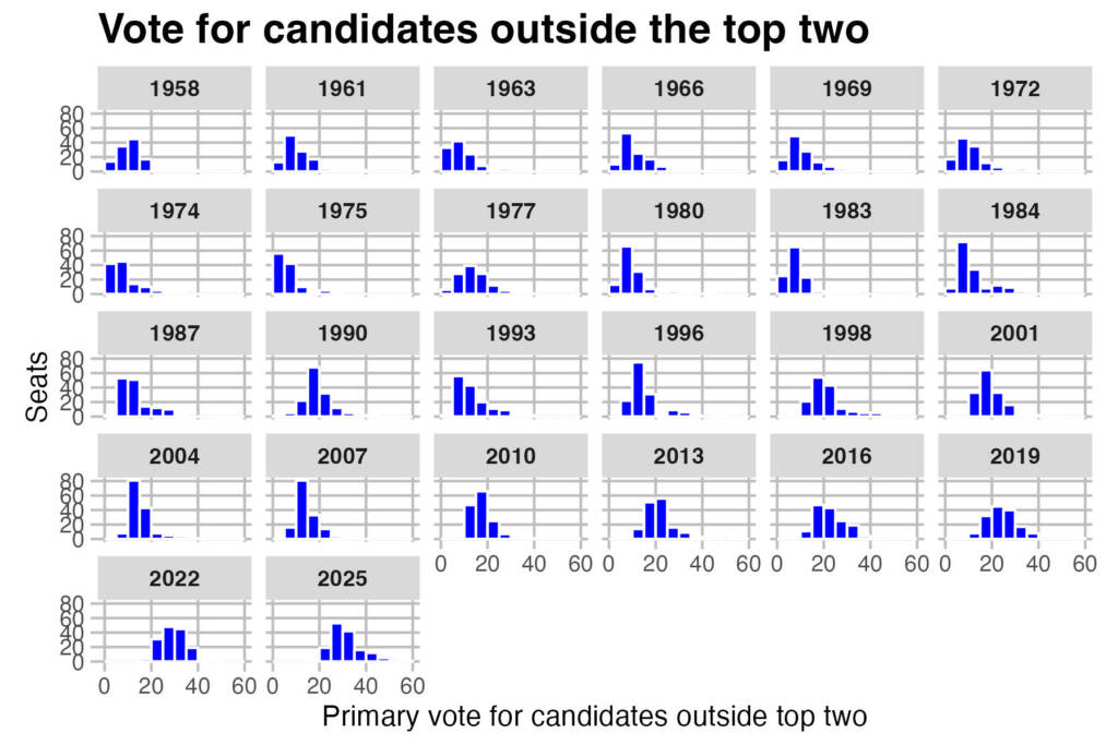
That little bell curve keep curving further to the right. The seat of Calwell broke the record in 2025 for the biggest primary vote share for candidates who did not make the 2CP, with 57.5%. The previous record was 56.4% for Mallee in 2019 and before that Calare in 1996 with 49.8%. No other seat has ever reached that high, but 2025 has a lot more seats reaching highs that used to be extremely rare.

Ugh. Please don’t use jpg for charts. Ideally SVG, but png or gif is better than jpg.
Is McMillan 1972 the strongest preference flow any federal candidate has ever received? (95% flowed to Country party!!) Holt in Groom 2022 would be up there too I imagine.
It’s interesting how consistent a bellcurve the “winning primary vote” distribution is year to year. It makes me think that naive economic models of how elections work (e.g., simple additive effects from individual policies, or something like that) are more likely that I thought.
@Henry, if you’re wondering as a proportion of preferences, then the highest proportion is Gwydir in 1975, the National Country candidated received 97.7% of all preferences, but that was off a preference pool of just 1.5%. McMillan 1972 was ranked fifth on this metric, behind Batman 1961, Eden-Monaro 1975 and McMillan 1974.
If you’re wondering as a proportion of the total formal vote, the National in Mallee in 2019 received 38.4% of the formal vote as preferences, but that was barely 2/3s of the preferences that flowed. McMillan 1972 is second, and that was 35.8% of the formal vote, or 95.2% of all preferences.
Liberal policy the last 50 years boils down to “managing the decline.”
Voters aren’t buying that anymore, so Labor will be running wild in the vacuum for a while yet.
Who has had the lowest primary vote and come back to win? These days, with a large crossbench and 3-4 corner contests in many seats, the primary vote has been dropping like a rock. If Boele wins in Bradfield, off 27%, there will be a massive volume of preferences—not just % but numbers.
A win is a win, but a campaign is trickier in seats with more viable candidates. We didn’t know the top two candidates in Calwell for some time. It was a Labor seat, and they did come in first on primaries and ultimately won on a reduced margin. But it was very fluid.
That said, this election probably produced wider margins overall due to the relative weakness of the Liberal offering. The Labor Party is the dominant party, and the 2PP reflects that. When the Liberals figure out how to begin to regain the ground they have lost, things will start to get spicy. Then we might start seeing a lot of Calwells.
I wonder if there is stronger support for “first past the post” among older people? Anyone over about 60 might well remember a time when the winning candidate got the most votes:
“The 1990 federal election was the first election in the modern era where less than half of voters cast a first preference vote for the winner in their seat.”
Winning the most votes is not the same as winning a majority.
The vast majority of seats are still won by the candidate leading on primary votes, they’re just not getting over 50%.
@Jimmy we haven’t had FPTP voting for over a hundred years.
That’s not what Jimmy is saying. He’s saying that for older people, when they were younger it was typical that that the winning candidate would win a majority of the vote (which is true but is not relevant to FPTP) or that the winning candidate was more likely to be the first-placed candidate (which was slightly more true but not particularly so).
Minor parties have come and gone, and factional splits have emerged and dissipated. Still, it does seem that, especially since the 2022 elections, there is an unusually high level of alternative party activity these days. Unusual in the sense that they are competitive enough to win seats. That is not a problem with the process but a reflection of the volatility of the electorate. If you look at a seat like Bradfield, under an FPTP system, Kapterian would have won the seat on 38% of the vote. Many would argue that it is less fair and less reflective of the electorate’s intentions than the independent candidate winning by a 26-vote margin. We are a long way from anyone other than the Coalition or Labor forming government. Still, we have already seen the occasional hung parliament propped up by the crossbench, and of course, the Senate is already fluid. The advantages of a preferential system, in my opinion, far outweigh the complaints. Expecting the two major parties to continue to get 85-90% of the primary vote is unrealistic these days in the pluralistic society we live in, with younger people having different pain points than older, etc. Generational concerns are nothing new, but they seem to move more rapidly these days than in the past. In the end, someone has to form a government, and I, for one, would rather it be someone that the electorate seems to agree has a broad mandate, lest we end up like Italy, with revolving-door governments, or the US having a madman casting a spell over everything.
Comments are closed.