I’ve been making and posting my Google Earth electoral maps on my blog since day one, and I have now got quite a large collection posted. These include national electoral maps for the United Kingdom, United States, Australia, New Zealand, Canada and Ireland, as well as subnational maps in Australian and the UK.
Some of my maps now cover up to four elections for the same jurisdiction. In order to view these in an interesting and simple way, I’ve developed a format which allows you to quickly flick between different maps for the same area, while holding to the same position on the map.
I’ve produced a number of these time-series maps, including state maps for New South Wales, Victoria, Queensland and South Australia, and national maps for Australia, Canada and the United Kingdom.
You can access them through a new page dedicated to time-series maps.
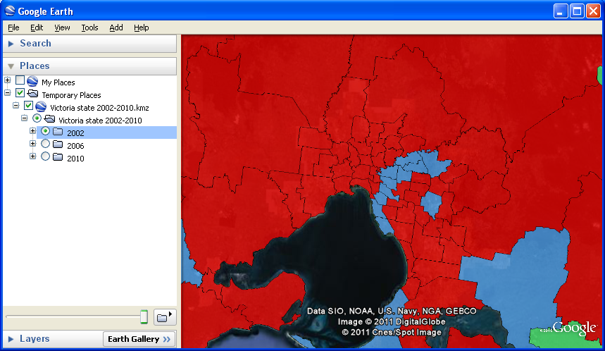
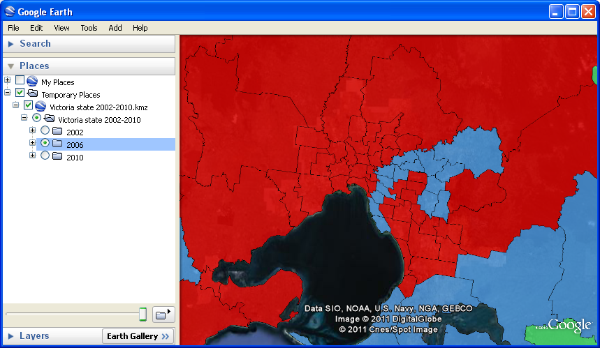
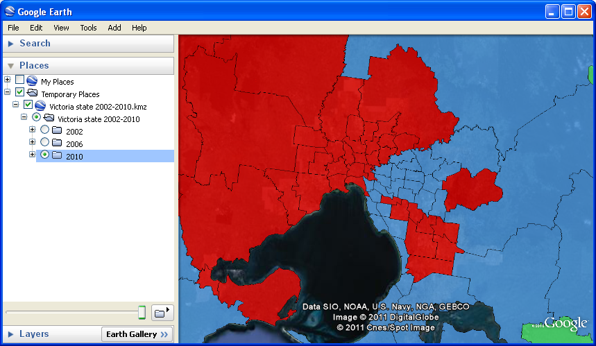
The following images show you how these maps are designed to work, in this case using the example of the Victorian state elections from 2002 to 2010.
Click to enlarge each image to its full size.


Nice. The blue is the spread of the zombie apocalypse right?
Worse. It is the Liberal Party.
It appears to have been spread by the Yarra River :p
Lovely blue sea driving back the arid red bits … 🙂
Seriously, though, there are some blue bits missing from the SA 2010 map: Norwood, Adelaide etc.
Great work though – keep it up.
Yes, it looks like the SA 2010 map is the pre-election map, not the results map. They’re easy to manually update yourself though.
Comments are closed.