
When Australian elections were dominated by two major parties, Labor and the Coalition, the pendulum evolved as a simple tool to lay out the relative marginality of each seat. But things are more complicated now – politics is no longer just about Labor and the Coalition. This reached a new extreme at the recent South Australian state election, with just 13 out of 47 seats ending up as classic Labor-Liberal contests.
In this post, I’m going to look at what a new South Australian pendulum could look like, look also at seats where there was a chance that another party would have made it to the top two, and what margin that could have produced, and use some triangular graphs to show how the contest played out in particular types of races.
For a while now, my pendulums have not strictly obeyed the rules of the traditional two-party-preferred pendulum. I include all seats held by the government on the left sorted by the two-candidate-preferred margin, even when that is not the 2PP margin. It does mean that sometimes you need to be aware that not all seats are alike – you wouldn’t necessarily assume swings in Labor-Greens contests would be similar to Labor-Liberal seats. Effectively the pendulum becomes more about listing seats broadly in line with marginality rather than using it as a predictive tool.
It turns out this method doesn’t actually work too badly in the case of the 2026 South Australian election.
Most seats in South Australia ended up as contests between Labor and one of two right-wing parties: either One Nation or the Liberal Party: 38 out of 47 seats, to be exact.
So I’ve slightly modified my traditional pendulum to list Liberal and One Nation seats mixed together on the right, with independent seats at the bottom right.
This pendulum allows you to get a sense of how much of a swing would be needed from Labor towards these two different right-wing parties to deprive Labor of a majority.
If Labor was to lose eleven seats, it would deprive them of a majority. If One Nation and the Liberal Party gained fifteen seats between them, they would hold a majority. I don’t know what such a majority would look like, but it’s a notable threshold.
This pendulum shows that a uniform swing of 8.5% would leave Labor without a majority, and 10.3% would produce a Liberal-One Nation majority. If we assume that the balance between Liberal and One Nation was to remain steady, One Nation would pick up more of those seats than the Liberal Party and would be the bigger party in such a majority.
| Labor Seats | Other Seats | ||
| Seat | Margin | Seat | Margin |
| Morphett | ALP 0.7% vs LIB | Narungga | ON 0.2% vs LIB |
| Light | ALP 1.6% vs ON | Heysen | LIB 0.6% vs ALP |
| Taylor | ALP 4.2% vs ON | MacKillop | ON 0.8% vs LIB |
| Elizabeth | ALP 4.5% vs ON | Hammond | ON 4.9% vs ALP |
| Hartley | ALP 4.7% vs LIB | Chaffey | LIB 6.0% vs ON |
| King | ALP 5.2% vs ON | Ngadjuri | ON 7.1% vs ALP |
| Mawson | ALP 6.6% vs ON | Bragg | LIB 8.5% vs ALP |
| Unley | ALP 6.8% vs LIB | Flinders | LIB 9.6% vs ON |
| Dunstan | ALP 8.1% vs LIB | Schubert | LIB 17.4% vs ALP |
| Morialta | ALP 8.5% vs LIB | ||
| Giles | ALP 8.5% vs ON | ||
| Lee | ALP 9.4% vs ON | ||
| Colton | ALP 9.9% vs LIB | ||
| Reynell | ALP 10.1% vs ON | ||
| Newland | ALP 10.3% vs ON | ||
| Hurtle Vale | ALP 10.8% vs ON | ||
| Kaurna | ALP 12.0% vs ON | ||
| Wright | ALP 12.5% vs ON | ||
| Ramsay | ALP 12.9% vs ON | ||
| Gibson | ALP 13.7% vs LIB | ||
| Port Adelaide | ALP 14.4% vs ON | ||
| Black | ALP 15.4% vs ON | ||
| Torrens | ALP 15.6% vs ON | ||
| Florey | ALP 16.1% vs ON | ||
| Davenport | ALP 16.4% vs ON | ||
| Cheltenham | ALP 17.0% vs ON | ||
| Playford | ALP 17.2% vs ON | ||
| Adelaide | ALP 18.2% vs LIB | ||
| Enfield | ALP 18.8% vs ON | ||
| Elder | ALP 19.1% vs LIB | ||
| Waite | ALP 19.7% vs LIB | Finniss | IND 5.2% vs LIB |
| Badcoe | ALP 21.2% vs ON | Stuart | IND 6.9% vs ON |
| West Torrens | ALP 23.2% vs ON | Mount Gambier | IND 10.4% vs ON |
| Croydon | ALP 24.0% vs GRN | Kavel | IND 10.6% vs ALP |
While a pendulum can still be interesting, it presumes that there are only two candidates of interest in a seat, and that the two-candidate-preferred pairing is the only possible such pairing. Of course, this is not true.
There has been a number of seats in the past where there was a tight margin on the three-candidate-preferred between two candidates, and the outcome of that contest would then have an impact on the final two-candidate-preferred margin. Sometimes one contender produces a much closer margin than the other contender, and sometimes it actually changes who would win.
In some cases we have hard data on the margin in the alternative scenario, but it’s also possible to take preference flows from other seats and use them to make an estimate.
As of this election, there are now enough of these seats that it’s worth dealing with these systemically, and producing a table of these alternatives.
The gap between second place and third place on the 3CP was 12.1% on average. There were 24 out of 47 seats where the margin was less than 10%, so I’ve focused on those seats. In two cases (Heysen and Croydon) the margin was less than 1%. This really matters in Heysen, and doesn’t matter at all in Croydon, as we’ll see.
The alternative 2CP margin only changes the outcome in two seats. In Hammond, Labor topped the 3CP count, but lose to whoever out of Liberal or One Nation makes the top two. One Nation outpolled Liberal by 4.9% on the 3CP. The 2CP margin over Labor is about the same for either party. In Ngadjuri, One Nation beat Labor. If the Liberal Party closed an 8.5% 3CP margin over Labor, they would have then won on Labor preferences.
In some seats, the alternative margins are fairly similar, but in some cases they produce very different margins.
There’s a bunch of seats where the Liberal Party is substituted for One Nation, or vice versa, and the margin ends up quite similar. There are ten seats that flipped between ALP-ON and ALP-LIB, and they won nine (the remaining seat was Hammond). The Liberal Party would have come closer to winning in Enfield and Torrens, while One Nation’s margin was wider in every seat. But none of them are particularly close.
There are four seats where independents have a big impact on the margin. Independents came third in Black, Port Adelaide and Flinders, with One Nation coming second on the 3CP in all three seats. My estimated margin gets much tighter if One Nation is replaced with the independent. It’s worth noting that there isn’t much of a sample size of One Nation preferences splitting between an independent and either Labor or Liberal, and it would undoubtedly vary depending on the specific independent. In this case, I’ve used the Kavel preference count to estimate One Nation preference flows between Labor and Independent, and I’ve used Finniss to estimate ON flows between Liberal and Independent.
In Narungga, the replacement of the Liberal Party with an independent actually significantly increases the One Nation margin from 0.2% to 12.4%. Independent preferences favour Liberal over One Nation, but Liberal preferences favour One Nation over the independent.
And then there’s Heysen, which doesn’t change much, but is the most marginal seat on this list on every measure. Liberal beat Labor by 0.6%. Labor beat the Greens on the 3CP count by just 0.4%. By my estimate of Labor preferences between Liberal and Greens (using examples from Heysen in 2014, federal elections in 2022 and 2025, and Prahran in Victorian elections), the margin is just 0.2%.
| Electorate | 2CP margin | 3CP margin | Alt. 2CP margin |
| Adelaide | ALP 18.2% vs LIB | LIB 8.9% over GRN | ALP 20.1% vs GRN |
| Badcoe | ALP 21.2% vs ON | ON 8.0% over GRN | ALP 20.3% vs GRN |
| Black | ALP 15.4% vs ON | ON 7.4% over IND | ALP 10.2% vs IND |
| Colton | ALP 9.9% vs LIB | LIB 7.2% over ON | ALP 12.5% vs ON |
| Croydon | ALP 24.0% vs GRN | GRN 0.6% over ON | ALP 27.9% vs ON |
| Davenport | ALP 16.4% vs ON | ON 5.8% over LIB | ALP 17.8% vs LIB |
| Elder | ALP 19.1% vs LIB | LIB 4.1% over ON | ALP 20.5% vs ON |
| Enfield | ALP 18.8% vs ON | ON 2.9% over LIB | ALP 16.7% vs LIB |
| Finniss | IND 5.2% vs LIB | LIB 5.7% over ON | IND 3.4% vs ON |
| Flinders | LIB 9.6% vs ON | ON 6.2% over IND | LIB 5.0% vs IND |
| Gibson | ALP 13.7% vs LIB | LIB 8.7% over ON | ALP 16.2% vs ON |
| Hammond | ON 4.9% vs ALP | ON 4.9% over LIB | LIB 2.1% vs ALP |
| Heysen | LIB 0.6% vs ALP | ALP 0.4% over GRN | LIB 0.2% vs GRN |
| Kavel | IND 10.6% vs ALP | ALP 4.3% over LIB | IND 12.7% vs LIB |
| Lee | ALP 9.4% vs ON | ON 9.7% over LIB | ALP 12.3% vs LIB |
| Mawson | ALP 6.6% vs ON | ON 9.3% over LIB | ALP 10.2% vs LIB |
| Morialta | ALP 8.5% vs LIB | LIB 7.2% over ON | ALP 11.3% vs ON |
| Narungga | ON 0.2% vs LIB | LIB 5.8% over IND | ON 12.4% vs IND |
| Ngadjuri | ON 7.1% vs ALP | ALP 8.5% over LIB | LIB 2.4% vs ON |
| Port Adelaide | ALP 14.4% vs ON | ON 4.9% over IND | ALP 6.6% vs IND |
| Schubert | LIB 17.4% vs ALP | ALP 2.2% over ON | LIB 18.1% vs ON |
| Torrens | ALP 15.6% vs ON | ON 5.3% over LIB | ALP 14.4% vs LIB |
| Waite | ALP 19.7% vs LIB | LIB 8.5% over GRN | ALP 22.9% vs GRN |
| West Torrens | ALP 23.2% vs ON | ON 4.7% over GRN | ALP 21.0% vs GRN |
The other method for combining two-candidate-preferred and three-candidate-preferred information is through the use of triangular graphs. I have started producing graphs for recent elections showing all seats with a given combination of parties in the 3CP, showing who wins for a given 3CP. My first version of my federal graphs are in this blog post.
These have been inspired by Ben Messenger who first developed triangular 3CP graphs. He has published his own version of these graphs for South Australia here on Bluesky.
Unfortunately South Australia’s election was so fragmented that we can’t show every seat in one chart. I’ve made charts for three 3CP combinations that cover 39 out of 46 seats.
First up, this chart shows Labor-Liberal-One Nation contests – there were 20 in South Australia.
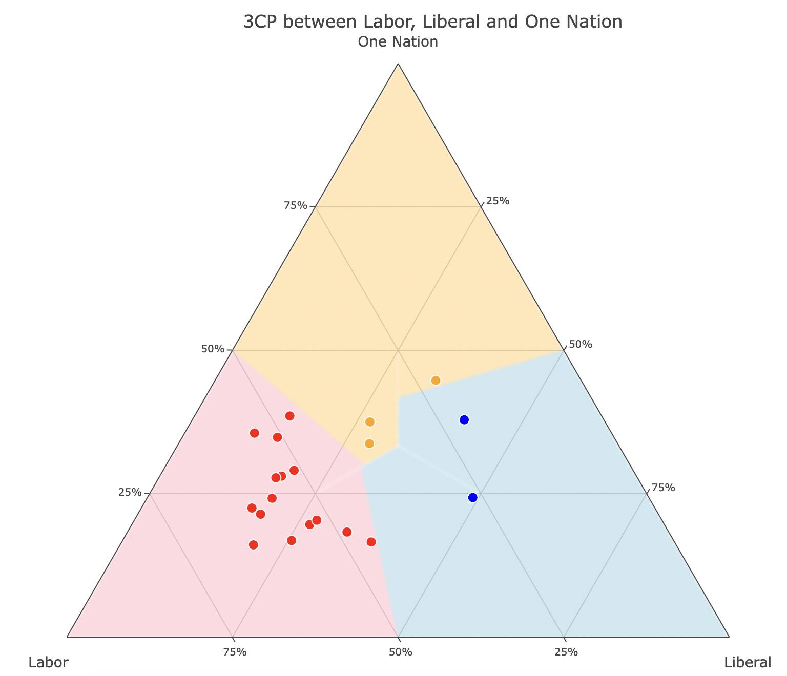
The lighter colours in the background show who would have won for a given 3CP, based on average preference flows (the same numbers used to estimate alternative 2CPs). The brighter dots are actual seat results.
Labor won most of these seats, but Labor needs a relatively higher 3CP to win in such a contest. Labor preferences slightly favour Liberal over One Nation, which explains the blue bulge sticking into the One Nation territory.
There were thirteen Labor-One Nation-Greens contests.
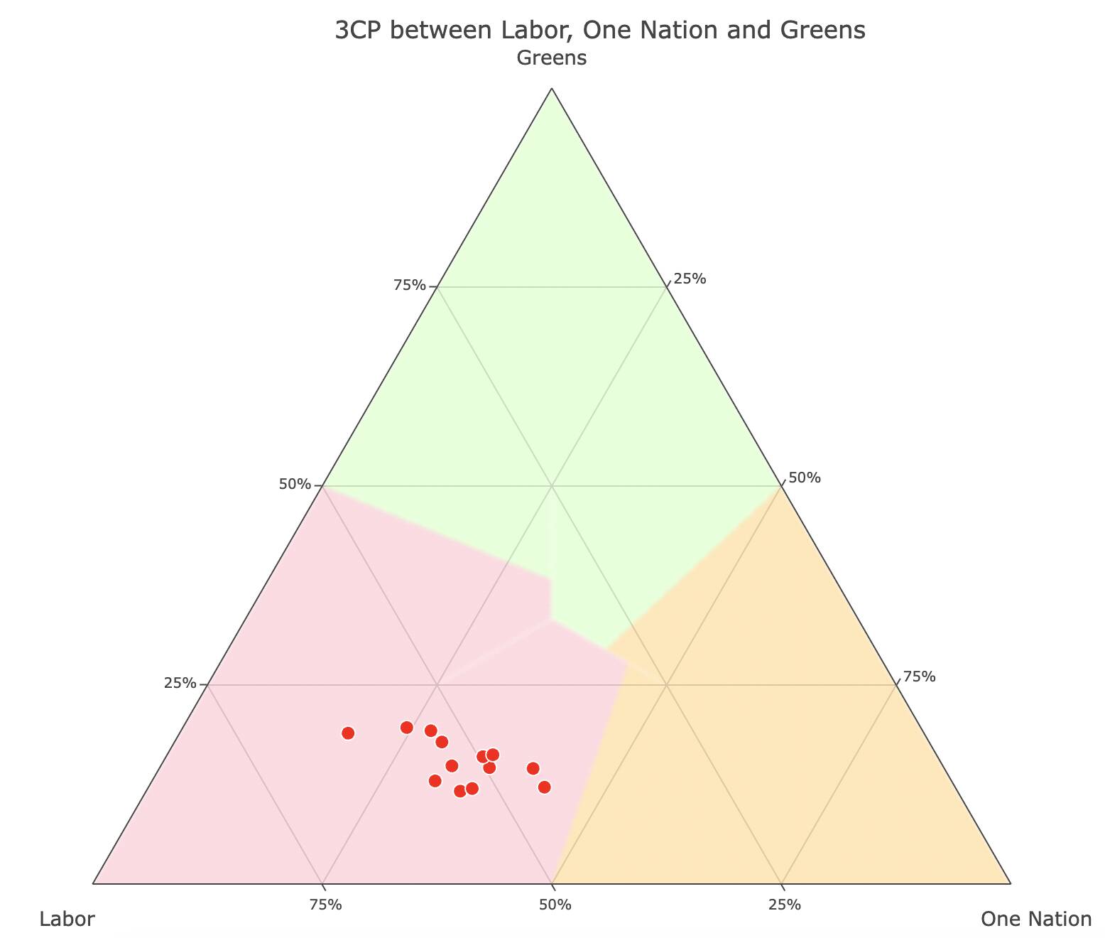
Labor won every single one of these seats, and generally can win with a lower 3CP than when they face two right-wing opponents.
There were six Labor-Liberal-Greens seats. It’s notable that the Labor zone is larger against the Greens than when One Nation is the third party, but One Nation also has a slightly larger zone than the Liberals. I think this reflects that Labor-Greens preference flows are less tight when facing off against One Nation – there are some Labor voters who preference One Nation when they wouldn’t preference Liberal, but that is also true of some Greens voters.
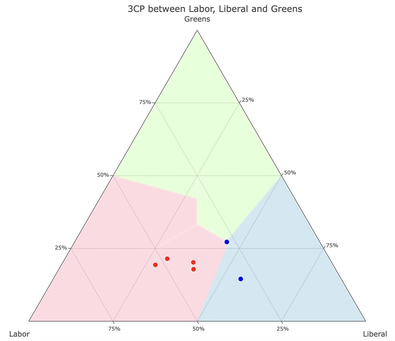
There is one seat that stands out above all others – the blue dot on the corner of the blue, red and green zones is Heysen. This chart makes it very clear that it’s a seat that all three parties could win with a slight nudge in their direction.
None of these methods are a perfect way of showing marginality of seats, but I think they are useful in exploring different angles of the contest. If we have more multi-party elections coming soon, I expect we’ll use these tools more often.
