For today’s post, I wanted to explore how much referendum results vary geographically – how much variety there is by seat and by state.
There’s been quite a bit of variety in how tightly-clustered the states have been over time, although it’s very clear that multiple referendums held at the same time usually follow similar patterns.
Things look a bit different at the seat level – it looks like the amount of variety declined as the twentieth century went on.
Let’s start at the state level.
This chart shows every constitutional referendum held from 1901 to 1999. It shows how the most pro-Yes state and the most pro-No state differed from the national Yes vote.
Some referendums were much more tightly-clustered. The six 1913 referendums, and the 1906 referendum stand out. The 1910 State Debts referendum had the greatest divergence, largely due to NSW voting extremely differently from the rest of the country.
It looks like there’s reason to think the states tend to vote closer to each other when referendums are held alongside elections, but there are plenty of exceptions. The average gap between the best and worst state was 16.5% for election-day referendums and 18.5% for mid-term referendums.
The gaps tended to widen from 1919 to 1937, but then became much smaller from 1944 until 1974, with the exception of the 1967 Parliament referendum. The 1977 Simultaneous Elections referendum had one of the widest gaps, much wider than the other three (successful) referendums held on the same day, and that explains why it was defeated despite winning a majority of the vote.
The referendums in the 1980s and 1990s have tended to have much less variety in the vote between the states, which partially explains why we haven’t had any states vote Yes since 1984.
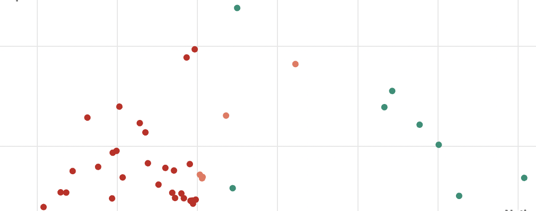
When you compare that gap to the national Yes vote, you find an interesting arc.
The referendums with the widest divergences tend to have close national Yes votes. I guess it makes sense: referendums with very strong votes one way or the other don’t really have room for as much variation.
I’ve coloured each dot by the result of the referendum, and you can see the reason why some referendums failed to achieve the double majority.
The 1946 and 1984 referendums didn’t have much variation, but they only won the national vote narrowly, so a slight bias towards smaller states was enough to bring them down.
The 1937 and 1977 referendums won more comfortably, but had much bigger gaps between the states. If those gaps were more narrow, you’d have expected them to win. And the 1910 State Debts referendum won despite a huge gap because it went in the other direction, with the most populous state voting No.
Now let’s look at the numbers at the seat level. Even if the variation was narrow at the state level, you could expect to see more variation at a seat level if the main divides were within the states, not between them.
Since there are so many seats (75-148 over the century), I am not just looking at the range between the top and bottom seats. Mostly I am looking at the seats that ranked at the 25th and 75th percentile, and the gap between them, which would cover half the seats in the country.
For this next chart, I’ve plotted out how much the 10th, 25th, 50th (median), 75th and 90th percentile seats vary from the national Yes vote.
The 1906 Senate terms and 1967 Aboriginals referendums were the most tightly clustered. The most distributed include the 1910 State Debts referendum (that one comes up a lot) and the 1919 referendums.
It’s also interesting to look at the referendums where the median seat is substantially divergent from the national vote. If the median is higher than the national vote, it suggests a more concentrated No vote and a more evenly distributed Yes vote.
The State Debts referendum had a much higher median Yes vote. This makes sense, since the No vote was so strongly concentrated in NSW. The 1913 referendums had low median votes, and the 1977 referendums had quite a concentrated No vote – which may have helped Yes win three out of four.
Since 1984, the median seat has been very close to even.
I thought I noticed a bit of a trend of the range of results getting narrower over time.
There definitely has been a downward trend, although one could argue that not much changed from the 1940s until the 1990s.
I think this data gives us some sense of how much we might expect the spread of results to be in this year’s referendum. If the Yes vote ends up in the low 40s, you’d expect less than a quarter of seats to vote Yes. But not every referendum is the same.


Ben
Typo in second para., after the ’Range of Support’ graph.
‘Election’ to replace ‘referendum’
Comments are closed.