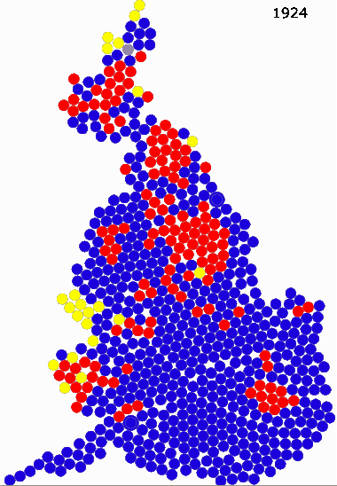
I’ve come across an interesting election animation, showing the electoral map of every UK election since the Reform Act of 1832, showing the geographical distribution of Conservative, Labour and Liberal/Liberal Democrat seats since that time as a cartogram.
You can clearly see the shift over time, with the appearance of Labour in the late 1800s and the decline of the Liberals from the time that the universal franchise was introduced in the early 1920s.


That’s brilliant! Love it! Would be interesting to do that for Australia …
Comments are closed.