Last month I posted an analysis looking at how much seats have moved in terms of their two-party-preferred rank, relative to every other seat in the country. Matt Cowgill on Twitter suggested I also look at the average size of swings in each seat in absolute terms (ie. ignoring whether the swings went one way or the other) to judge which seats seemed to be the most swingy.
This statistic could go in line with the changes in rank, but it doesn’t necessarily follow along. A seat could slowly swing in one direction continuously over 15 years, or could swing back and forth and end up roughly where it started.
So in this post I’ve produced a map showing this metric for each seat, and I look at the seats at the top and bottom end of the scale.
For this analysis I’ve looked at the swings at each of the five elections from 2007 to 2019, based on my data adjusting past election results for current electoral boundaries.
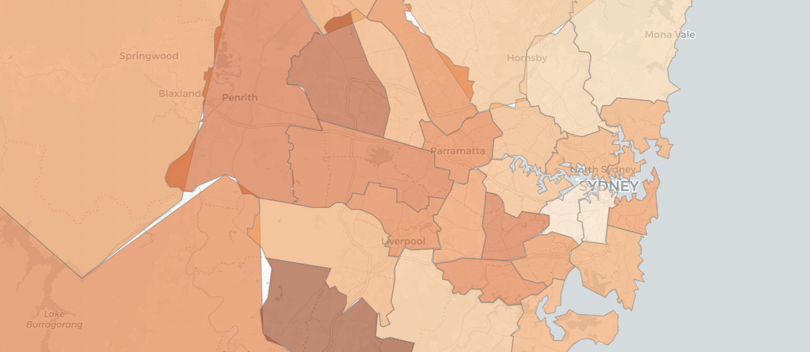
This map shows this statistic for each electorate.
The seat with the highest average swing is Dawson, with 7.68%. The seat swung very hard to Labor in 2007, swung back to the LNP in 2010 and 2013, again swung to Labor in 2016, and swung very hard to the LNP in 2019. Every swing was 4.3% or more, and the swing was over 10% in 2007 and 2019. Dawson’s early swings saw the seat change hands twice in two terms, but over the last few terms it has shifted strongly into the LNP column.
The next on the list is Bass in northern Tasmania, with an average swing of 6.97%. Bass experienced swings of 9-11% in 2013 and 2016, and reasonably sizeable swings in the other elections. Unlike Dawson, Bass remains very marginal and has probably changed hands more than any other seat over that time period.
Macarthur was third with 6.92%. Macarthur saw double digit swings in 2007 and 2016. It managed third place despite a swing of just 0.08% in 2019.
The remainder of the top ten are:
- Capricornia (6.84%)
- Chifley (6.44%)
- Forde (6.33%)
- Hawke (6.20%)
- Spence (6.16%)
- Flynn (6.13%)
- Paterson (6.12%)
This includes three seats in central Queensland, with six seats in outer suburbia.
At the other end of the scale, the seat of Moore in Perth has swung on average by just 1.3%. The swing was between 1.1% and 1.4% at three elections. It was slightly larger in 2010 (2.5% to the Liberal Party) but just 0.17% in 2019.
Fenner in northern Canberra has swung on average by just 1.46%, while Fremantle, Canberra and Melbourne have only swung by about 1.7%. Bear in mind all of these swings are looking at two-party-preferred vote between Labor and Coalition, so it ignores the strengthening Greens vote in the seat of Melbourne.
The next five are:
- Perth (1.80%)
- Bean (2.11%)
- Tangney (2.25%)
- McPherson (2.28%)
- Swan (2.31%)
This list includes five Perth-area electorates, and all three ACT electorates.
When you look at the map, you see some broader trends. Tasmania and Queensland tend to have bigger swings, particularly in regional areas. South Australia also shows up as having strong swings. Western Australia ranks low, with urban areas having particularly small swings.
Regional New South Wales and Victoria tend to have smaller swings, but there are clusters of seats in Western Sydney and Western Melbourne which have had bigger swings, along with parts of the Hunter and Illawarra.
UPDATE
After posting this I came to a realisation that there was another question I want to answer, and I don’t have any spare days for another blog post before the election: does the size of past absolute swing predict future swing?
First I looked to see whether the absolute size of the swing at the 2019 election had a relationship with the average absolute swing at the previous four elections. No luck, the correlation was +0.17 and the scatter plot was pretty much just a cloud.
But if you look at the swing in 2019 to or from Labor compared to the average absolute swing, that does appear to have a relationship. The correlation is -0.47, and the chart does show something.
The 2019 election saw some seats swing one way, and others swing the other. It looks to me like Labor gained ground in seats which don't normally swing that much, and lost ground in the traditional swinging seats. Very interesting, and may have some implications for the longer term trends I've been analysing.


Thanks Ben
I shall take a look at my own analysis of this statistic, which cover swings back to about 1958
Very complicated maybe look at state wide swing then measure how elastic swing is. Eg say nsw swings 5% then look at swings 2 or 4 % below this average or above it . QLD last election causes problems with this measure. Would need to have long term figures
Nuthin’ is correlated with nuthin’
Here a a few stats from 182 electorates in the 1958-2019 period (N=2998 results).
Brand is swingiest
Namadgi is least
Mean 4.22%
Min 0.71%
Max 8.43%
Skewness 2.33
Kurtosis 9.11
StDev 4.06%
Z score ranges -.87 to +.8, with a centre-point at -0.07
No signif correlation with past results;
with average results;
with anything much;
– typically R-sqs are about .001 or less
So … the tea leaves reveal nothing
I did an analysis on about 2880 electorate results from 1958 to 2019, which I summarised by saying “nuthin’ correlates with nuthin'”
There was about 20 lines more, but I think it all went down the plug-hole … so the above will have to do
Comments are closed.