So I’ve started working on a project that I will reveal in a few weeks’ time as part of this blog. One of the things I am doing is making booth maps of each federal electorate. I have made three so far, and on each one I have designed the map differently. I thought I’d post them all so people can let me know what is the best way to design these maps.
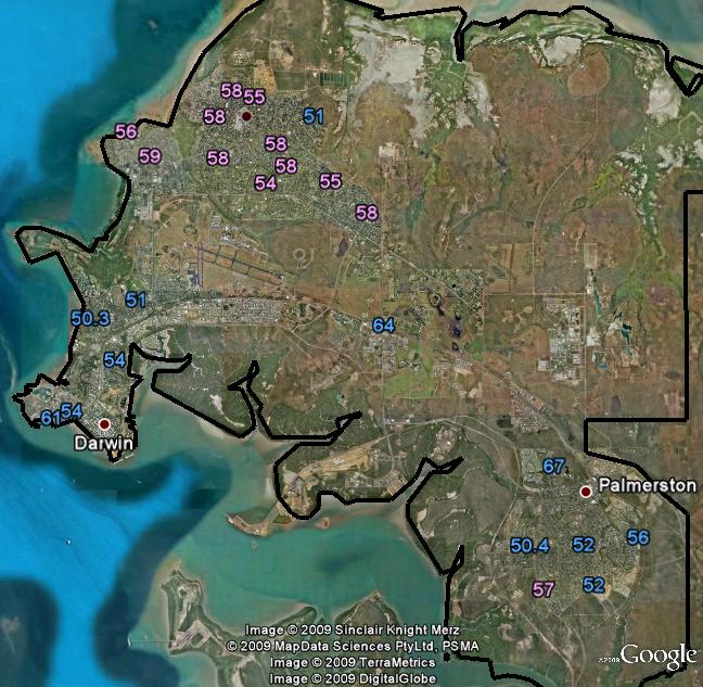
First, this map is Solomon. On it you can see Darwin and Palmerston. This map is higher-resolution, which means when reduced to the same size as the later maps, the numbers are quite small, and you need to blow up the map to read it’s information. I plan to fix that. But the point with this map is that booths are coloured according to which party won the booth, and what % of the 2PP that party got in that booth.

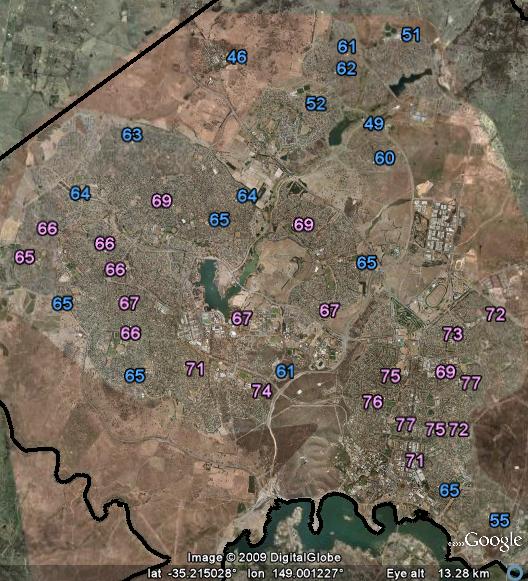
Next is Fraser. Now, almost all of Fraser’s booths were won by Labor, so I changed the design. Instead, all booths show the ALP % (including those won by the Liberals) and the colouring shows booths according to whether they were more or less pro-ALP than the seatwide total. Does this make sense? Or does it confuse people into thinking the Liberals won all those booths?

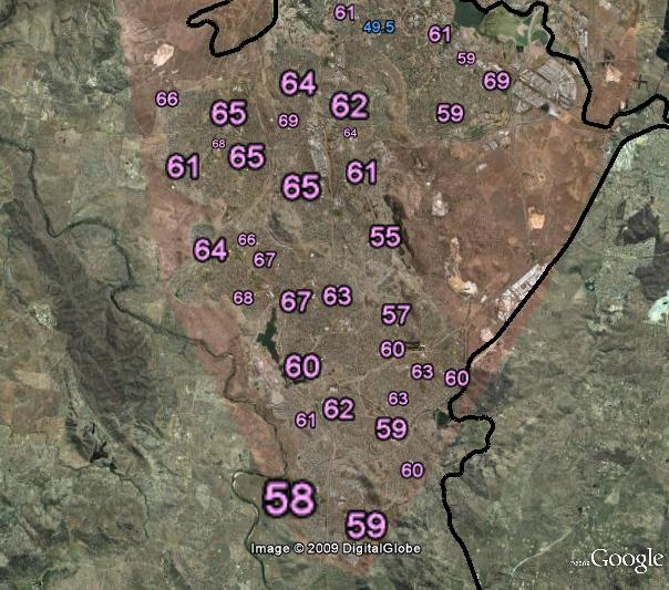
Finally, Canberra. In this case, I reverted to the colour scheme of Solomon while still showing all booths according to how much of the 2PP vote Labor won. However, I also scaled the booths according to the number of votes cast.

So what do you think? Which features work best? I plan to do these for almost every electorate in the country (although a few, such as Lingiari, are impossible to show meaningfully in such a format)


1st one is best. i think it is the clearest. i.e. in meaning.
Hi Ben, Nice start. Personally, I prefer the maps like the Canberra one, which show the relative size of the both as well as who won each booth – I notice that with Canberra you are doing this as an ALP vs everyone else, so all percentage are in relation to the ALP. As you correctly surmise from the Fraser map, colouring a value blue means people will think it was won by the Libs. While interesting to see which booths performed better or worse against the state (or national) averages, I think that would be the work of a separate, quite specific, mapping exercise.
So, my 2c worth is use the Solomon system for showing who won the booth, but with the Canberra system for showing relative booth size.
Wow, it is fantastic that new booth maps are being made. I think pink is… fab-u-lous! Perhaps red might be more apt :P.
Hi Ben,
In model 2, how would you draw a seat which was in contention between an independent and a National/Liberal/Green?
About a year ago Ben I was trying to do something very similar, but rather than use the 2pp info I was using the Greens results. I applaud your efforts and if you need some help, give me an email.
The Canberra one is clearly best and most useful. The Fraser method is quite confusing.
I stopped because it was going to be such a laborious process unless I forked out hundreds of dollars for google earth pro and purchase space on flickr. How are you doing it?
@Rationalist – I tried using a darker shade of red. It’s completely illegible. Think of it as ‘light red’ if that helps.
@Alister – I think the same principles apply regardless of who the two candidates are. I’ve previously done similar maps showing the Greens primary vote, I probably will do those in seats with high Greens votes. Indeed, that is where I would consider colouring booths according to being above- or below-average, otherwise all booths would be the same colour.
@Joel – It’s not terribly difficult, really. Nathan Lambert a few months ago produced a Google Earth map of both the 2PP and Greens primary vote booth results for the last federal election. That gives me the exact location of the booths, then I take them and change them so it looks like I want.
I guess I’d favour the Canberra version. The Fraser version is obviously only suited for looking at one seat at a time, but I can see how I might use it occasionally as I do sometimes like to compare individual booths to the average across the electorate.
Nathan’s maps don’t have all booths on them. It looks like he left out all booths with under 400 votes, and New England has been completely left out. Amongst other things, for instance, leaving out these small booths has meant that the booths with the biggest % of Green votes in Richmond are missing. This is a difficult question you’ll have to work out, as including all the smaller booths means there’ll be several hundred, if not into the thousands, of booths to add, but if you leave them out it’s not really the complete picture.
G’Day Ben,
I’m actually processing all this data at the moment as part of version 2 of myrepresentatives.org.au.
I will shortly (within the next week or so) have all the polling places geocoded and have the straight count and 2PP results for each polling place for all divisions in a DB. Once done, you’re welcome to it.
What you’re doing looks really good and a great use of the data I’m producing!
Jeffery
What’s the aim of your project? I see your current site (minus the .au) just provides an address search feature which brings up lists of federal and state MPs for that area. What are you aiming to end up with?
Does Ben know you’re using his data at the moment?
Nice work Ben, Canberra is dry!
Hi Ben, these are really interesting. Can you vary the intensity of the font colour to illustrate a booth’s deviation from the seat-wide vote % total? The stronger the font color, the deeper the vote. That way you can likely wrap style 2 into style 1 or 3.
Can you give two values for each booth: the ALP % and the Lib %? Perhaps a nice red blue. That way the percentage to others can be estimated..
In any case, these are great!
Again, good work Ben. Could I suggest that you put suburb names in small letters, for those of us who don’t know our Canberra aerial geography?
Hi Ben
I favour the approached used for Canberra
If you could find a colour that showed up well enough on the maps, I think a lighter and darker shade of one colour would be much less confusing when you want to show the strength of a vote in an area dominated by one party – on the other hand the numbers do this anyway so i question whether it’s worth it?
I like the Canberra electorate style too.
It’d be nice if you could do something similar by putting a little pie at each booth location, with the proportions of the pie showing the vote and the overall area the number of votes cast. That way you could even show primaries…
Ben, this is a great idea. I agree with others who say that the Canberra map is clearest. If it’s possible (and not too much work), it would be useful to be able to click on a booth number, and have a pop-up or mouse-over that shows the street address of the booth. It’d make it in useful in cross-referencing the booth location with census information.
Comments are closed.