
The results of the Australian Election Study was released yesterday morning with a great deal of information about how and why Australians voted at the recent federal election. The AES is a long-standing study which has been conducted on every federal election since 1987, and gives us an opportunity to ask voters about what motivated their vote, and match that up against demographic characteristics to get a richer sense of why the election went the way it did.
In this post I thought I’d run through a few of the interesting points to emerge.
A lot of attention has been paid to the relative popularity of Scott Morrison and Bill Shorten. The survey found that the number of voters who said they voted based on the party leaders is lower than ever before, and was particularly low for Labor voters (4%, compared to 13% for Coalition voters).
Shorten’s popularity was the second-lowest for a major party leader at any election since the survey began, but was only slightly lower than it had been in 2016. Morrison ranked roughly in the middle, ranking behind John Howard and Bob Hawke at their election victories, Kim Beazley at his two elections and Kevin Rudd in 2007.
Satisfaction rates with democracy and our political system are at the lowest level since the 1970s, although there has been very little change since 2016. Just 59% say they are satisfied with democracy, compared to over 80% at the 2004 and 2007 elections. Only 25% say the government can be trusted, compared to 43% in 2007.
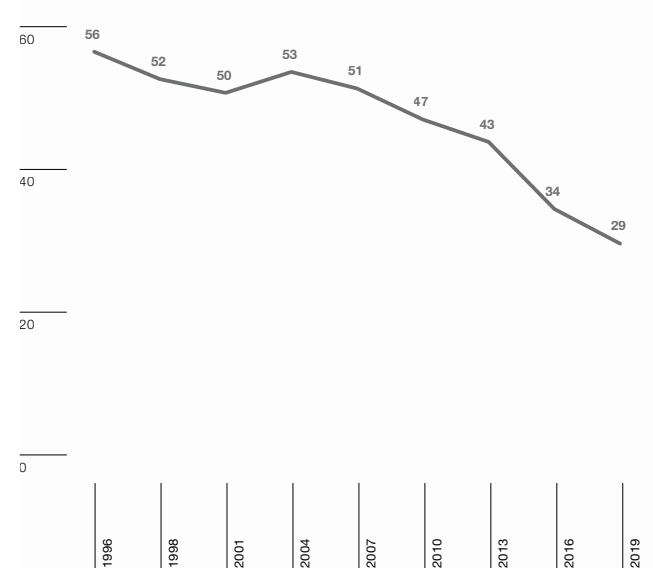
The use of how-to-vote cards is lower than ever before, with just 29% following a how to vote card for the House of Representatives. This rate has been steadily declining from over 50% between 1996 and 2007, but the rate of decline has increased sharply since 2013.
The proportion of people who are stable Labor or Coalition voters continues to drop into the teens, and voting volatility is at its highest levels (although again not much has changed since 2016).
40% of Labor voters say they considered changing their vote in the campaign, the highest level in the history of the survey. The equivalent figure was just 24% for the Coalition, which is roughly in line with the 1987, 1990, 1998 and 2016 surveys.
The survey suggests that policy was particularly important in 2019. 66% said that policy issues were the biggest consideration in their voting decision, compared to less than 50% in the early 2000s. There was a marked spike in those who said there was a “good deal of difference” between the parties, with 40% answering thus, compared to a similar figure in the high 20s or low 30s at most recent elections.
There was a spike in people nominating the environment or global warming as their most important non-economic issue to a combined total of over 20%, and the Coalition dropped significantly in terms of those who preferred their policies on the environment. But there was a significant widening of the gap in terms of voters preferring the Coalition’s policies on taxation. 41% of voters said they preferred the Coalition policy, with a big drop in those who said they saw no difference.
In one that should give hope my comrades in the ALP, perceptions of policy divergence is at its highest since the early 90s. People perceived strong differences between the major parties. pic.twitter.com/Ttda5gUVQX
— grug stan (@sicksadhack) December 9, 2019
There was a spike in the numbers of people who said the economy, taxation, the environment and global warming were “very important” but these mostly came at the expense of the numbers who had previously said “quite important”. Presumably those voters who rated economy and taxation as more important are different to those moving on global warming or the environment. Interestingly, Coalition voters are more supportive of reforms on negative gearing and franking credits than might have been expected:
There are some interesting trends in terms of demographics in voting. The gender gap for Labor has narrowed slightly thanks to a loss of support amongst women but the gap for the Liberal Party remains at about 10%. Nevertheless there is still a substantial gender gap with women favouring Labor and men favouring the Coalition, a reversal from the 1990s (and likely for a long time before that) when men favoured Labor more than women.
But even more interesting is a number of other charts showing extreme polarisation by age, with the Coalition on 32% amongst 25-34 year olds and 59% amongst those 65 and older.
I find it even more interesting to look at the chart (in the next chart) between home owners and renters. The Coalition polls 50% amongst owners and just 27% amongst renters.
Quite the polarisation when it comes to age and home ownership #auspol pic.twitter.com/3bHaaKt0z7
— Oz (@redrabbleroz) December 8, 2019
Finally, I liked the following chart produced by William Bowe at Poll Bludger showing the shifts in votes between parties between 2016 and 2019. You can click through to the link in this tweet to see the interactive version of the chart.
How voters moved between the parties from 2016 to 2019, according to the ANU's Australian Election Study surveyhttps://t.co/M85VuzAxn1 pic.twitter.com/QOBTpBwhdX
— William Bowe (@PollBludger) December 9, 2019
I’m planning to return to the AES with a podcast at the end of the week (possibly will need to be published as late as Monday) so if you have any questions please drop them in the comments below.
