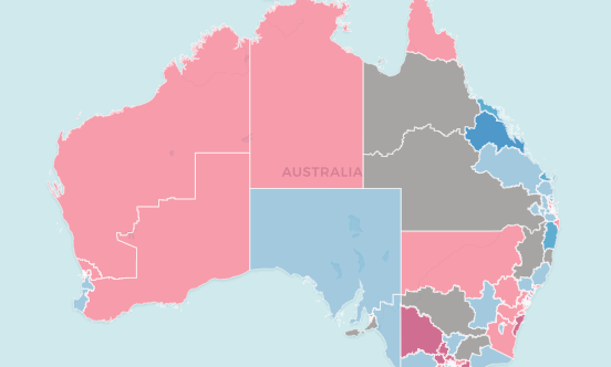
With all of the conversation about large swings in particular parts of the country at the recent election, a few people have been discussing how much this election’s trends are simply a reaction to the 2016 election, with Malcolm Turnbull and Scott Morrison appealing to very different demographics at the head of the same party.
It is possible that some areas swung in one direction in 2016 because of the popularity (or unpopularity) of Turnbull, which caused the swing in the opposite direction in 2019 to be larger, and by comparing the swings over two election cycles you could isolate which areas have moved the furthest since the Coalition first won power in 2013.
To do this I have added up the 2016 and 2019 two-party-preferred (2PP) swings in the 134 seats which are comparable (two others are completely new seats, while fifteen others are not Labor vs Coalition contests, so we will need to wait some time for the two-party-preferred figures in these seats). I’ll explain some issues with this method further down in the post, but I think the data is easily comparable.
Unsurprisingly, a string of Queensland seats have shifted towards the Liberal National Party against the national trend, while other seats (particularly those in Victoria) have swung most strongly to Labor.
I have then taken these figures and mapped them out, below the fold.
It’s worth noting that the overall Coalition vote is substantially lower in 2019 than in 2013. But this makes it more interesting to see which places have swung strongly to the Coalition.
And top of the list is Queensland. Labor has lost 11.3% in Capricornia since 2013, and over 5% in Hinkler, Dawson and Petrie. Seven of the ten seats with the biggest swings to the Coalition are in Queensland. The other three are Page (NSW, 6.7%), Cook (NSW, 3.7%) and Barker (SA, 3.7%). 18 out of 28 comparable Queensland seats have moved towards the LNP since 2013, while a majority of seats in every other state have moved towards Labor.
It’s also interesting to see which seats have shifted most strongly to Labor. Macarthur and Burt have both swung to Labor by over 11% over the last two elections. Both seats were subject to major redistribution changes prior to the 2016 election. Burt was newly created as a seat in a marginal part of a semi-safe Liberal seat, and has since shifted to become a 5% Labor seat. Macarthur shifted further into the Labor-friendly Campbelltown area in 2013, but it appears the area has swung even further towards Labor since that redistribution, possibly due to changing campaign decisions.
A lot of the seats which have shifted most strongly towards Labor are in Victoria, including Bendigo, Ballarat, McEwen and a lot of suburban Melbourne seats.
Notes on methodology
Kevin Bonham did attempt to get a sense of this a week ago, but he simply looked at how much each seat’s margin has changed between 2013 and 2019. This is problematic since every state and territory has held a redistribution since 2013, and in some places the boundaries have changed dramatically. Macarthur is almost 20% better for the ALP in 2019 than it was in 2013, but part of this is due to the electorate being pulled into the Campbelltown area prior to the 2016 election.
Instead I thought I would add up the two-party-preferred swings in each seat at the 2016 and 2019 elections. This firstly eliminates the influence of the pre-2016 redistributions, since the swings have been adjusted for that redistribution. It does mean the swings are not perfectly comparable in those states which held redistributions prior to the 2016 election. Unfortunately most of the country underwent redistributions in the last 3 years – only New South Wales and Western Australia were spared.
Fortunately the redistributions in Queensland, Tasmania and the Northern Territory were mild. 12 of the 37 seats in these three jurisdictions were completely unchanged, with another 23 experiencing less than 5% change. The Tasmanian seats of Bass and Clark experienced 10-15% change.
Changes were more dramatic in Victoria, South Australia and the ACT. The new seats of Fraser (VIC) and Canberra (ACT) can’t be compared at all, and the average change for the other 49 seats is 17.5%. In particular Hotham and Bruce were changed dramatically.
Despite these changes, I don’t think the scales of the swings have necessarily changed very much, and I think it still gives you a sense of the trends in different regions.


Ben – 2013 was a very strong coalition vote; 2010 something much closer to an ‘even’ vote – electorally, it was essentially a tie. Are you able to prepare a map showing changes form 2010 – I suspect we’d see any evidence of re-alignment of the sort some argue is afoot – swings against the coalition in SA and Vic; swings to them in Old and (perhaps) NSW.
I agree with Pyrmonter. No use using 2013 as a benchmark because it was such an aberration.
In South Australia the Libs have been a declining force for a decade. While they’re still very competitive (and have indeed gotten a swing towards them this time), they’re no where near the highs enjoyed during the Howard years. Think about all those previously marginal seats (Makin, Kingston, Adelaide etc) that the Libs were never really close to winning after 2007.
NSW is also becoming more problematic for Labor as their working class base becomes less rusted on. While Labor haven’t done too badly on seats (courtesy of the last redistribution), their vote is comparatively quite low, both in primary terms and 2PP terms.
Surprised to see the 2 ACT seats trending Liberal – presumably that’s a consequence of the split in seats, but both Fenner and Bean experienced 2PP swings to Liberals.
Keen to see an analysis of the ACT when results are finalised – where the Greens and Zed got their votes from.
Comments are closed.